2024 Week 25 | Power BI: Time Brush Slicer
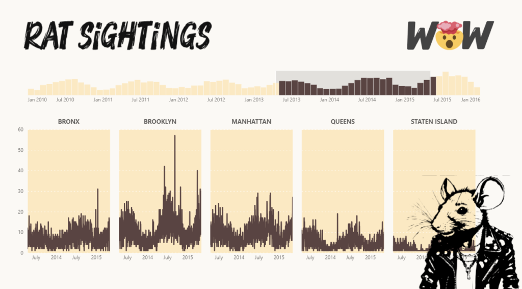
Introduction This week’s challenge looks to create a time brush slicer. The time brush slicer can be created with Deneb or another custom visual. Requirements Obtain the data from a previous challenge Model data Option A Import Timbrush Slicer and Small Multiple Custom Visual Create a time brush slicer Create a line chart with small …