
Introduction
This week’s challenge is a little different, we will be looking to make-over a report from the Australian Bureau of Statistics.
This report contains a lot of information and data sources to download, so it is up to you as to how much or how little you want to do.
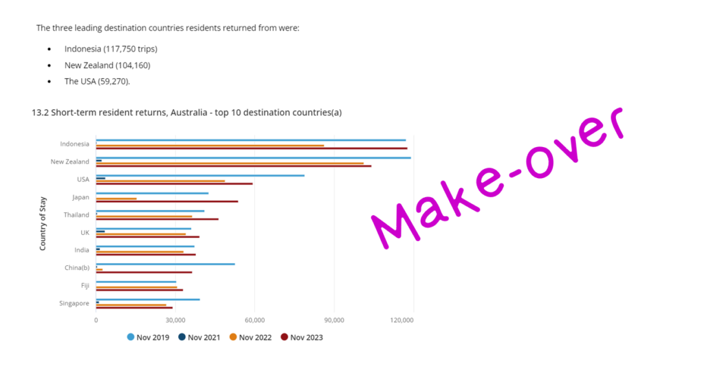
The primary challenge, however, is to highlight the key insight “Australians travel to Indonesia is now greater than pre-COVID levels”. Can you improve this bar chart to emphasise this insight, make it more readable and interpretable? Would you use a bar chart, another visual or custom visual? What other data and visuals would you bring in to supplement the story?
There is creative freedom with this challenge, as such, there will be no solution file this week.
Requirements
- Obtain the data from the ABS https://www.abs.gov.au/statistics/industry/tourism-and-transport/overseas-arrivals-and-departures-australia/nov-2023
- Get creative and improve on the bar chart design
Dataset
Obtain the data from Australian Bureau of Statistics:
(this chart is contained in reference period : November 2023; Release 16/01/2024
You can down load the chart data, or the data cubes provided at the bottom of the article for supplemental data.
Share
After you finish your workout, share on Twitter using the hashtags #WOW2023 and #PowerBI, and tag @MMarie, @shan_gsd, @KerryKolosko. Also make sure to fill out the Submission Tracker so that we can count you as a participant this week in order to track our participation throughout the year.
Solution
No solution file this week
Coming soon.