2022 Week 05 | Power BI: Can you make a Nested Chart with Charticulator?
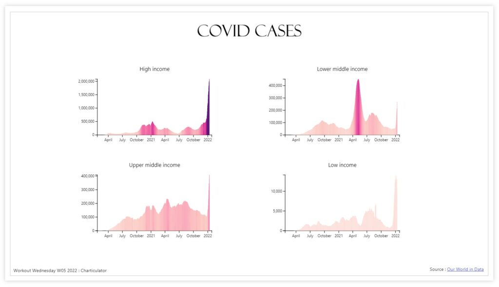
Introduction This week we are familiarising ourselves with Charticulator and Nested Charts. This graph was inspired by Gus Wezerek and Sara Chodosh’s chart for NYT Opinion. Requirements Download the data and remove all columns excepting the Date field, New Cases Smoothed Field and Location (save as csv) Create a second csv with only Location = […]
2022 Week 05 | Power BI: Can you make a Nested Chart with Charticulator? Read More »
Power BI, Workout Wednesday