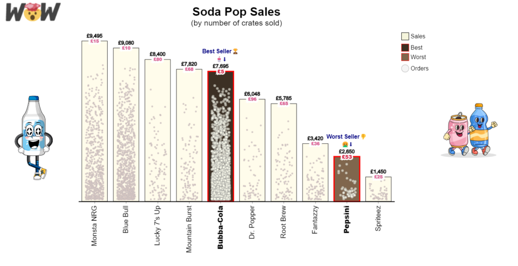
Power BI

The new button slicer used to filter a scatterplot

2023 Week 47 | Power BI: Use the New Button Slicer

Introduction The November 2023 release of Power BI Desktop includes the new button slicer visual. This visual can currently be used as a replacement for the original slicer visual when using tiles. There are more enhancements to come, but we already have a lot more control over the formatting of the slicer. We can add …

2023 Week 47 | Power BI: Use the New Button Slicer Read More »

2023 Week 45 | Power BI: Create a dumbbell chart with Deneb

Introduction Welcome back to Workout Wednesday! This week we’re creating a dumbbell chart to compare 2 sets of values using Deneb! If this is your first time using Deneb I highly recommend you play around with either the Vega or Vega-lite languages in the online editor, where you can load the code from examples, amend it, …

2023 Week 45 | Power BI: Create a dumbbell chart with Deneb Read More »

2023 Week 43 | Power BI: Faceted Stacked Bar Chart Comparison

Introduction This week’s challenge looks at two options for making faceted charts with multiple measures: the Deneb custom visual and the Stacked Bar Chart core visual. The charts compare two different measures across two attributes. You’ll have to get a little creative to accomplish this in both chart types.  Requirements Get the sample dataset from …

2023 Week 43 | Power BI: Faceted Stacked Bar Chart Comparison Read More »

2023 Week 42 | Power BI: Add value to tables with SVGs

Introduction Welcome back to Workout Wednesday! This week we’re adding value to tables using SVG images! I was inspired by Sean Miller’s Week 16 Tableau challenge, and thought we could re-create this in Power BI. In this challenge, you’ll use various techniques to enhance the presentation of data within your Power BI table visual. These techniques include utilizing …

2023 Week 42 | Power BI: Add value to tables with SVGs Read More »

2023 Week 40 | Power BI: Bar chart label bonanza

Introduction Last week’s workout caused some healthy discussion about bar chart labeling preferences and best practices. This week we will look at other ways to implement space saving labels while also showing the data labels for the each bar in a bar chart.  The report shown below demonstrates 4 ways to implement bar chart labels …

2023 Week 40 | Power BI: Bar chart label bonanza Read More »