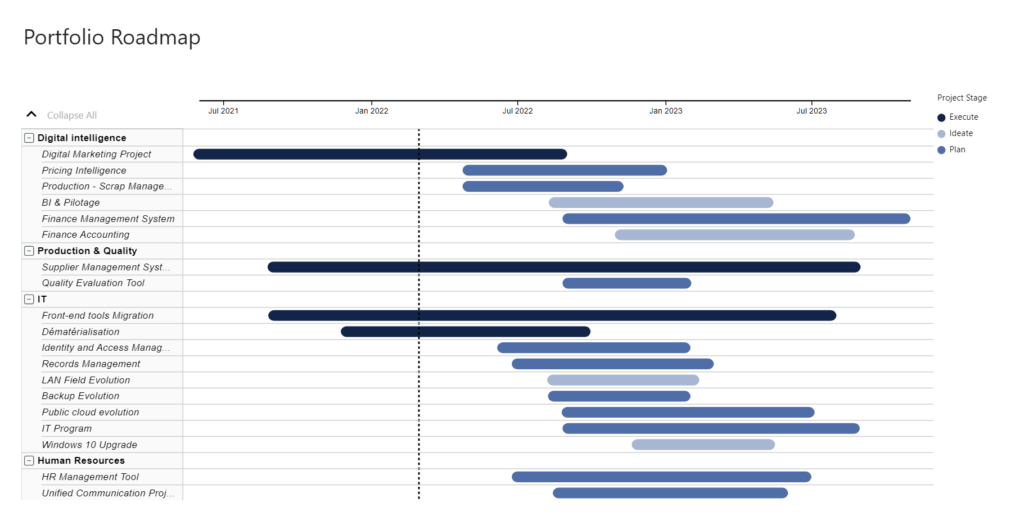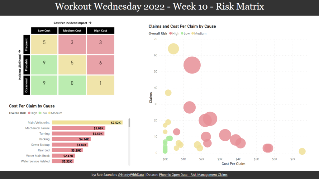
2022 Week 10 | Power BI: Risk Matrix
Introduction Your challenge this week is to create a Risk Matrix with some supporting visuals. We decided to keep the project management theme going this week. If you did not do last week’s challenge, I highly recommend you checkout Kerry’s Gantt Chart challenge, here. For this challenge, I looked at a lot of possible ways to create a …