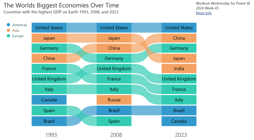
Power BI

2023 Week 40 | Power BI: Bar chart label bonanza

Introduction Last week’s workout caused some healthy discussion about bar chart labeling preferences and best practices. This week we will look at other ways to implement space saving labels while also showing the data labels for the each bar in a bar chart.  The report shown below demonstrates 4 ways to implement bar chart labels …

2023 Week 40 | Power BI: Bar chart label bonanza Read More

2023 Week 39 | Power BI: Bar chart custom labels

Introduction This week we’re revisiting Meagan’s challenge where we built a bar chart with long labels. We’re going to use a trick recently unveiled by Bas (@howtopowerbi on Twitter) to create custom labels for bar charts. If you have long labels in your bar chart, they may be truncated depending on the size of the …

2023 Week 39 | Power BI: Bar chart custom labels Read More

2023 Week 38 | Power BI: Visualize the State of Quantum Computing with Deneb

Introduction The race to dominate quantum computing has the potential to revolutionise various fields by solving complex problems that are currently intractable for classical computers.  This week we will recreate the infographic “The State of Quantum Computing” published in the Harvard Business Review magazine (Harvard Business Review, vol. 101, issue 2, 2023, p. 25). Requirements …

2023 Week 38 | Power BI: Visualize the State of Quantum Computing with Deneb Read More

A strip plot

2023 Week 35 | Power BI: Create a Faceted Instance Chart

Introduction Sometimes it can be useful to show all data points instead of aggregating them. That is where an instance chart, also called a strip plot or a barcode plot, can be useful. A strip plot is like a single-axis scatter plot. The symbol or shape used in the instance chart can vary, but it’s …

2023 Week 35 | Power BI: Create a Faceted Instance Chart Read More

2023 Week 34 | Power BI: Use core visuals with dynamic titles

Introduction Welcome back to Workout Wednesday! This week we’re building some basic visuals and use dynamic titles to visualize gas prices in the Rocky Mountain Region of the US (where I live!) over the past 3 years from the U.S. Energy Information Administration. Be sure you’re using the June 2023 version of Power BI desktop or later …

2023 Week 34 | Power BI: Use core visuals with dynamic titles Read More

2023 Week 33 | Power BI: Date Slicer

Introduction Welcome to the Workout Wednesday Week 32! This week’s challenge will focus on how to create an advanced date slicer in the Power BI report. A user-friendly and modern-looking slicer to level up your dashboards. You can create your own designs, share them with colleagues and control the preview.   To re-create, I am …

2023 Week 33 | Power BI: Date Slicer Read More

SVG Pictrogram

2023 Week 32 | Power BI: SVG Pictogram

Introduction This week’s challenge was inspired by FiveThirtyEight’s Nobody had more style than Jay Wright created by Ryan Best For this week’s challenge we will be creating SVGs with shape elements that are coloured dynamically based on field values. Create your own SVG and add your own flair to this design. Requirements Obtain the source data …

2023 Week 32 | Power BI: SVG Pictogram Read More

2023 Week 31 | Power BI: Create a Marimekko chart

Introduction Inspired by a Tableau Workout Wednesday from last year, we are going to make a Marimekko chart. A Marimekko chart, also known as a Mekko chart or mosaic plot, is used to visualize categorical data across two variables. Both axes use a percentage scale that determines the width or height of a bar. Think …

2023 Week 31 | Power BI: Create a Marimekko chart Read More

2023 Week 30 | Power BI: Build a smooth line chart

Introduction Welcome back to Workout Wednesday! This week we’re building a line chart using the new smoothing feature that was released this month! This week’s challenge was inspired by Andy Kreibel’s Makeover Monday challenge. We’re exploring the disappearing sea ice in the Antarctic using a line chart, looking at the extent of sea ice in millions of …

2023 Week 30 | Power BI: Build a smooth line chart Read More

Waffle chart created with core visuals

2023 Week 29 | Power BI: Core Visual Waffle Chart

Introduction If you’re as old as I am, you might remember MacGyver. For eight-year-old me, he was simply the coolest person who ever lived: he was a brilliant thinker and could get out of any situation with a Swiss Army knife and whatever was lying around. These days, to “MacGyver something” is a homage to …

2023 Week 29 | Power BI: Core Visual Waffle Chart Read More

Scroll to Top