2025 Week 5 | Power BI: Add an All Category to a Bar Chart
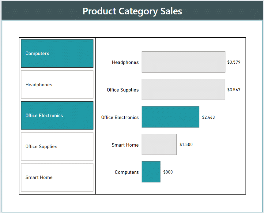
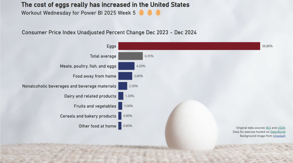
Introduction There are times where we want to compare categorical data with a total, perhaps an average. And sometimes we don’t want to see that total at the bottom of a table. So this week we are creating a bar chart that contains a “total average” bar. We want the bar chart sorted descending by …
2025 Week 5 | Power BI: Add an All Category to a Bar Chart Read More »