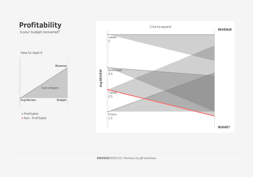
2020 Week 22: Profitability spotlight – is your budget recovered?
Introduction This week’s goal is to create a bi-dimensional chart (alternative parallel chart) that reveals if your budget has recovered or not. Parallel Coordinates represent multi-dimensional data across a set of vertical axis- different measures have different scales -, for this week’s challenge you will have to figure out how to show 2 different measures …
2020 Week 22: Profitability spotlight – is your budget recovered? Read More