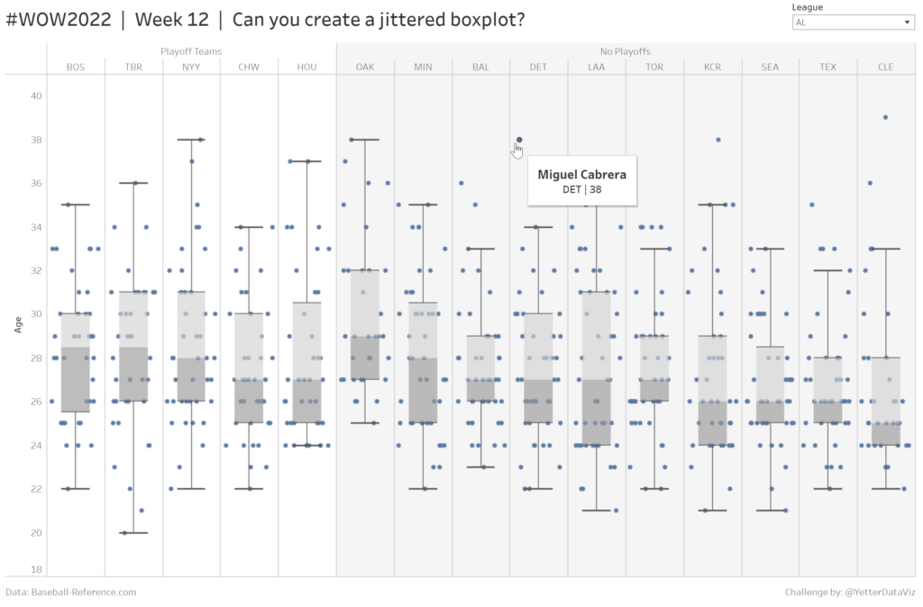
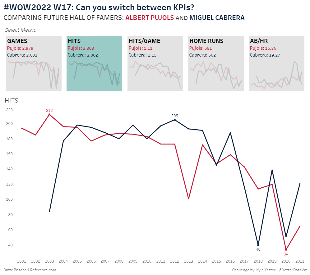
Tableau

#WOW2021 W42 | Tableau | Can you use set actions to create a reference date range?

Introduction This week I team up with Erica Hughes to create this fabulous challenge. I had an idea in my head to recreate something similar to the Brush Filter challenge by Sean. In my mind I did it with Parameter Actions, however when speaking to Erica she showed me the Set Actions Version. So that’s …

#WOW2021 W42 | Tableau | Can you use set actions to create a reference date range? Read More »

2021 Week 41 | Tableau: How Much Do Top Sub-Categories Contribute to Sales?

Introduction I hope everyone enjoyed Community Month!  I’m excited to be back and to share a fun challenge that highlights using pie charts (puns a plenty today!). This challenge is based on a request from a sales team – they wanted to understand how individual accounts contributed to their overall revenue.  The beauty of this …

2021 Week 41 | Tableau: How Much Do Top Sub-Categories Contribute to Sales? Read More »

2021 W40 | Tableau: Can You Make Stacked Bar Charts Easier to Compare?

Introduction I have a confession to make…I like stacked bar charts. Someone once referred to them as rectangular pie charts, which stung a little bit – so I’ve kept my affinity quiet. Stacked bar charts get a bad rap because it can be hard to compare the different components – in fact the only one …

2021 W40 | Tableau: Can You Make Stacked Bar Charts Easier to Compare? Read More »

2021 W38 | Tableau: How Can You Quickly Tell the Net Change Between Two Dates? (Community Challenge)

Introduction This week’s challenge is by Will Perkins About Will: Will has been actively involved with the external Tableau Community over the past 3 years. He has spoken at Tableau Fringe Fests, multiple TUGs, and mentored various individuals in one-off questions or more long term instances. At work, he has helped build an internal global …

2021 W38 | Tableau: How Can You Quickly Tell the Net Change Between Two Dates? (Community Challenge) Read More »

2021 Week 35 – How Much Change Has Occurred?

Introduction September 2021 is community month. Every year since 2018 we’ve invited individuals to share challenges with the community. This year we’ll have some amazing challenges from the Tableau and Power BI communities. But before we get there I’ll be sharing the following challenge: We’ll make a modified dot plot comparing sales for the current …

2021 Week 35 – How Much Change Has Occurred? Read More »

2021 Week 33 | Tableau: Can you create a moving average chart with a focus on selected subcategories?

Introduction After the results of the community survey, the top ranked feature was Table Calculations, so guess what? Let’s do some Table Calculations! Click to open in Tableau Public Requirements Dashboard 600 x 600 ONE SHEET Table Calcs ONLY! Create a parameter controlled moving average by month for sales. Create a way to multi-select subcategories …

2021 Week 33 | Tableau: Can you create a moving average chart with a focus on selected subcategories? Read More »

2021 Week 32 | Tableau: Visualize our Survey Data

Introduction We recently wrapped up a Survey for the Workout Wednesday community gauged at understanding what YOU are interested and what areas of opportunity our team may have. During our latest group meeting I was struck with the idea that this was the perfect opportunity to get a twofer – practice visualizing survey data AND …

2021 Week 32 | Tableau: Visualize our Survey Data Read More »

2021 Week 31: Can You Find the Needle in the Haystack?

Introduction The ability to efficiently find the proverbial needle in a haystack is worth its weight in gold.  How many times has a key stakeholder asked you to give them a shortlist of products (insert the focus of your analysis) to focus on for business improvement/optimization opportunities…and they’ve asked you to get back to them …

2021 Week 31: Can You Find the Needle in the Haystack? Read More »