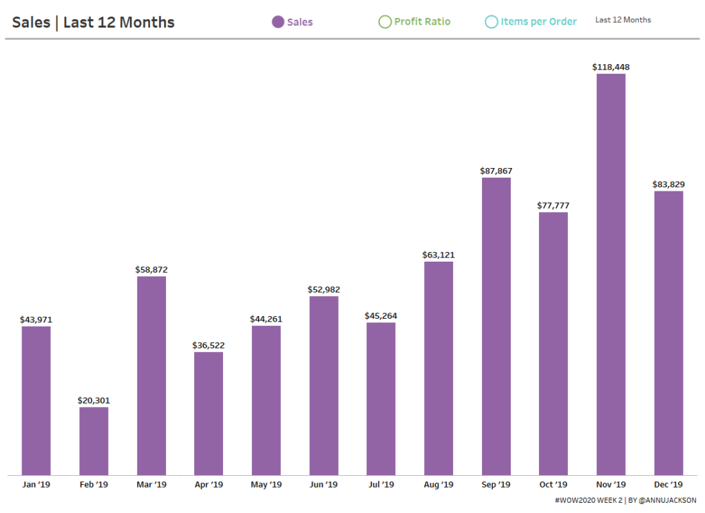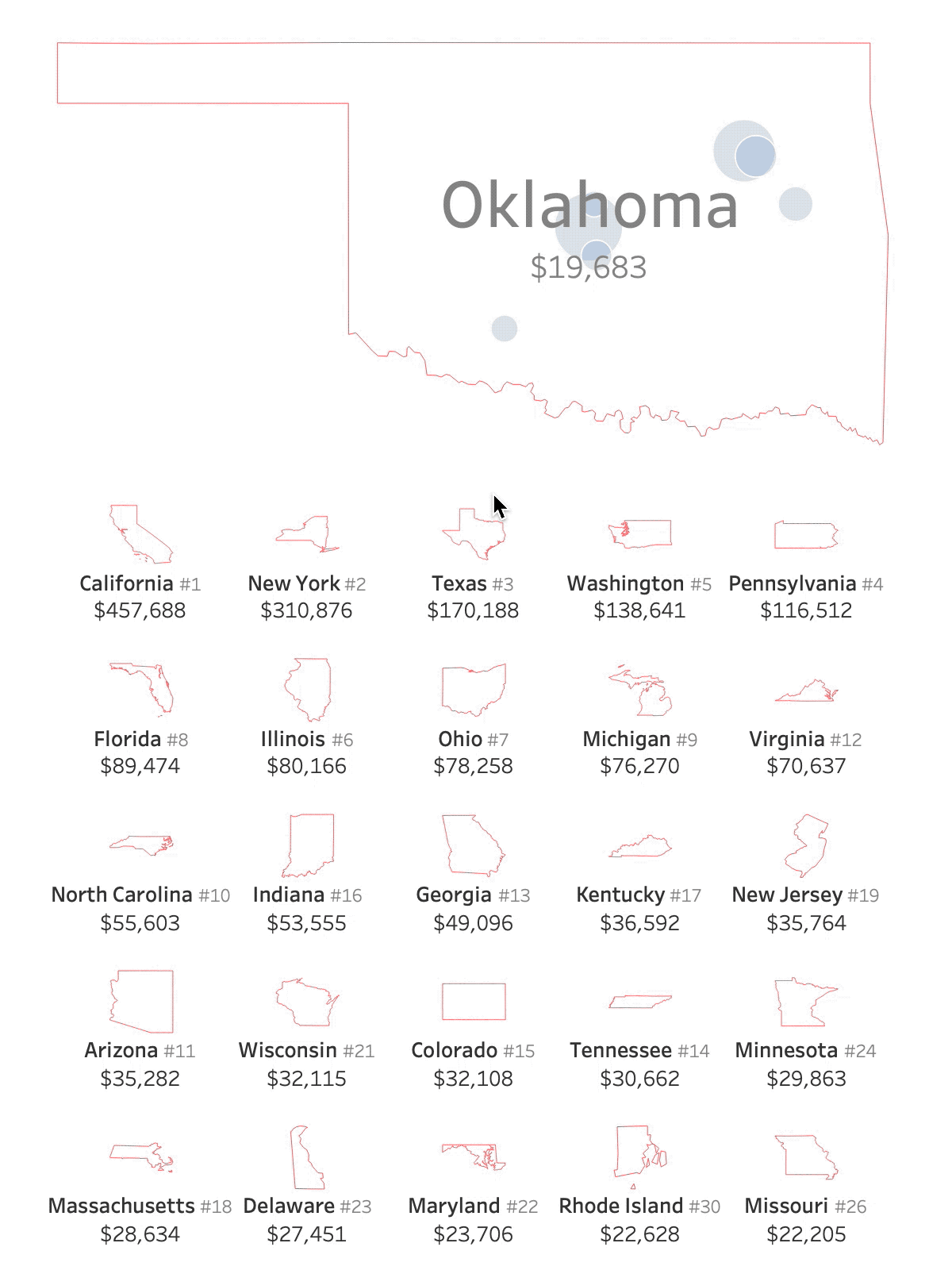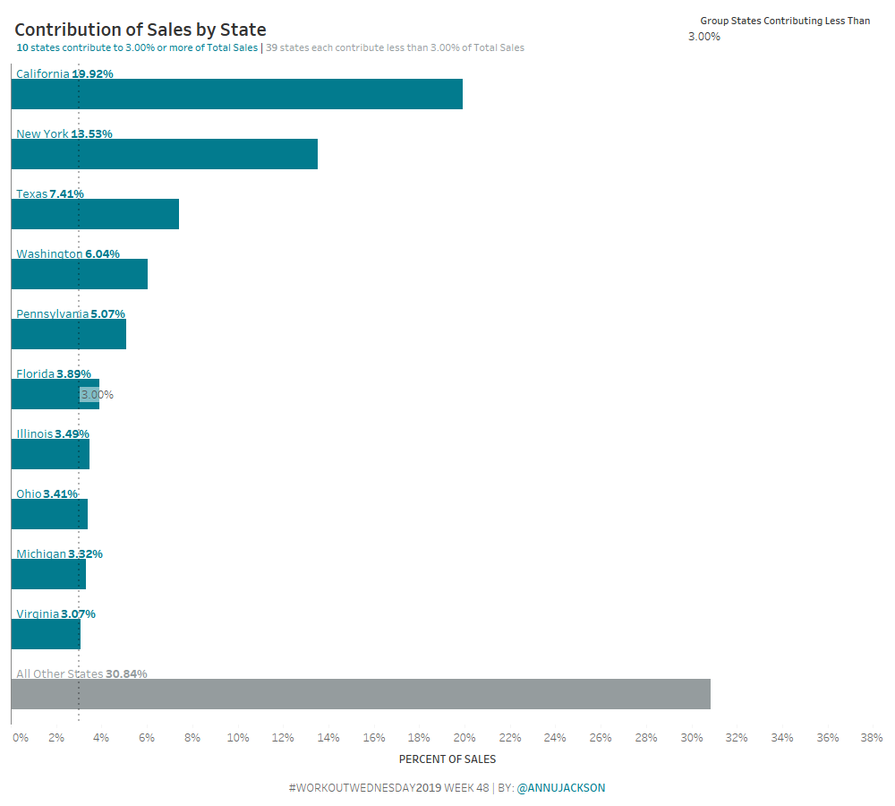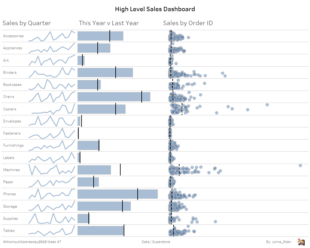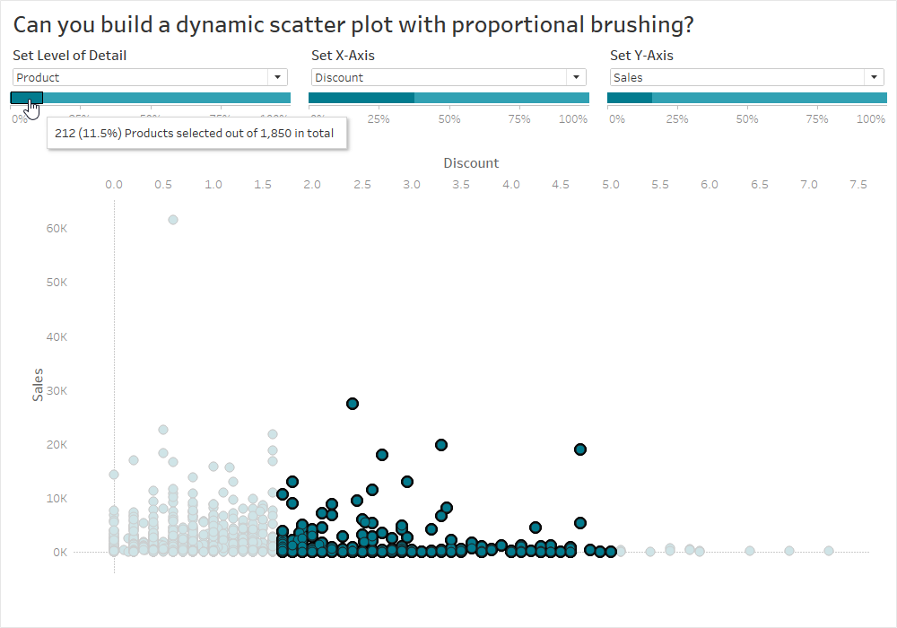
Week 3: Can you visualise time in a unique way?
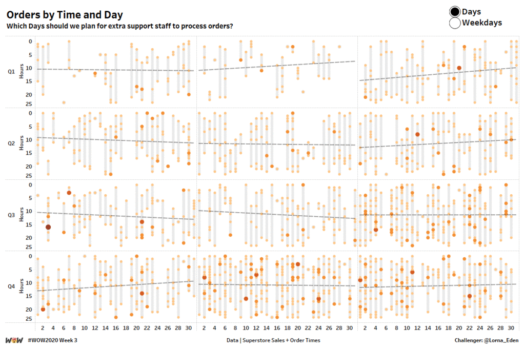
Introduction This week, I wanted to take a look at how people could visualise time in a unique way. My idea around this is planning. Looking at time in this manner allows people to look at workload / order load etc and see where was most and least popular, which will allow planning for the …