
Introduction
Welcome to week 2 of the CRMA intro sessions. If you missed week 1, you can either head over and do it now or upload this dataset into your dev org to get the basis for this dashboard.
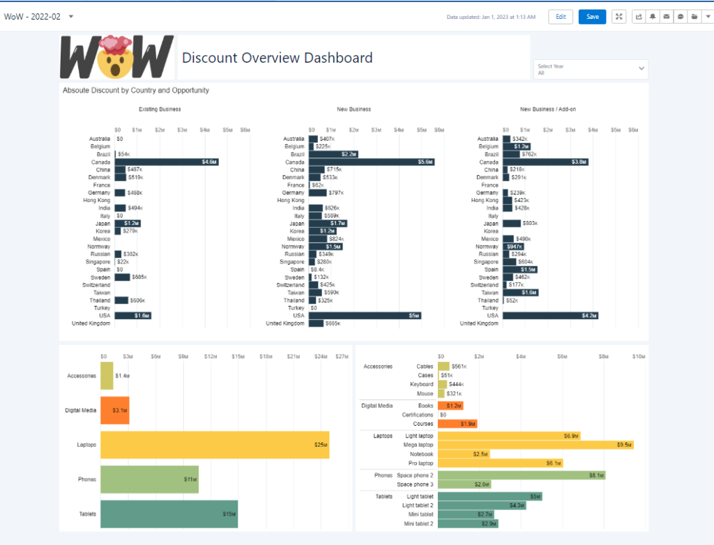
Last week we created a dataset to look at line item sales. This week we want to build a simple dashboard to see how much our products are discounted in different countries and for different product categories.
Requirements
- Title with #WoW logo (file here)
- Add filter to filter all charts by year
- Rename the filter title to “Select Year:”
- Bar chart showing Absolute Discount per Country per Opportunity Type
- Add chart title
- Apply a custom chart colour (rgb(35, 61, 77))
- remove axis titles
- remove legend
- remove gridlines
- Bar chart showing Absolute Discount by Product Category/ Product Name
- Sort by Product Category/ Product Name
- Colour both charts by Product Category
- rgb(207, 198, 100)
rgb(254, 127, 45)
rgb(252, 202, 70)
rgb(161, 193, 129)
rgb(97, 155, 138)
- rgb(207, 198, 100)
- Remove axis titles
- Remove legends
- All numbers should be formatted as currency
Hi all,
The video I made for the week 2 challenge:
https://www.youtube.com/watch?v=xU_t7Pe4KP8
Open to corrections, suggestions and remarks.
Cheers
Tim Dries
Pingback: 2023 Week 03 | Interactive Discount Dashboard – Workout Wednesday