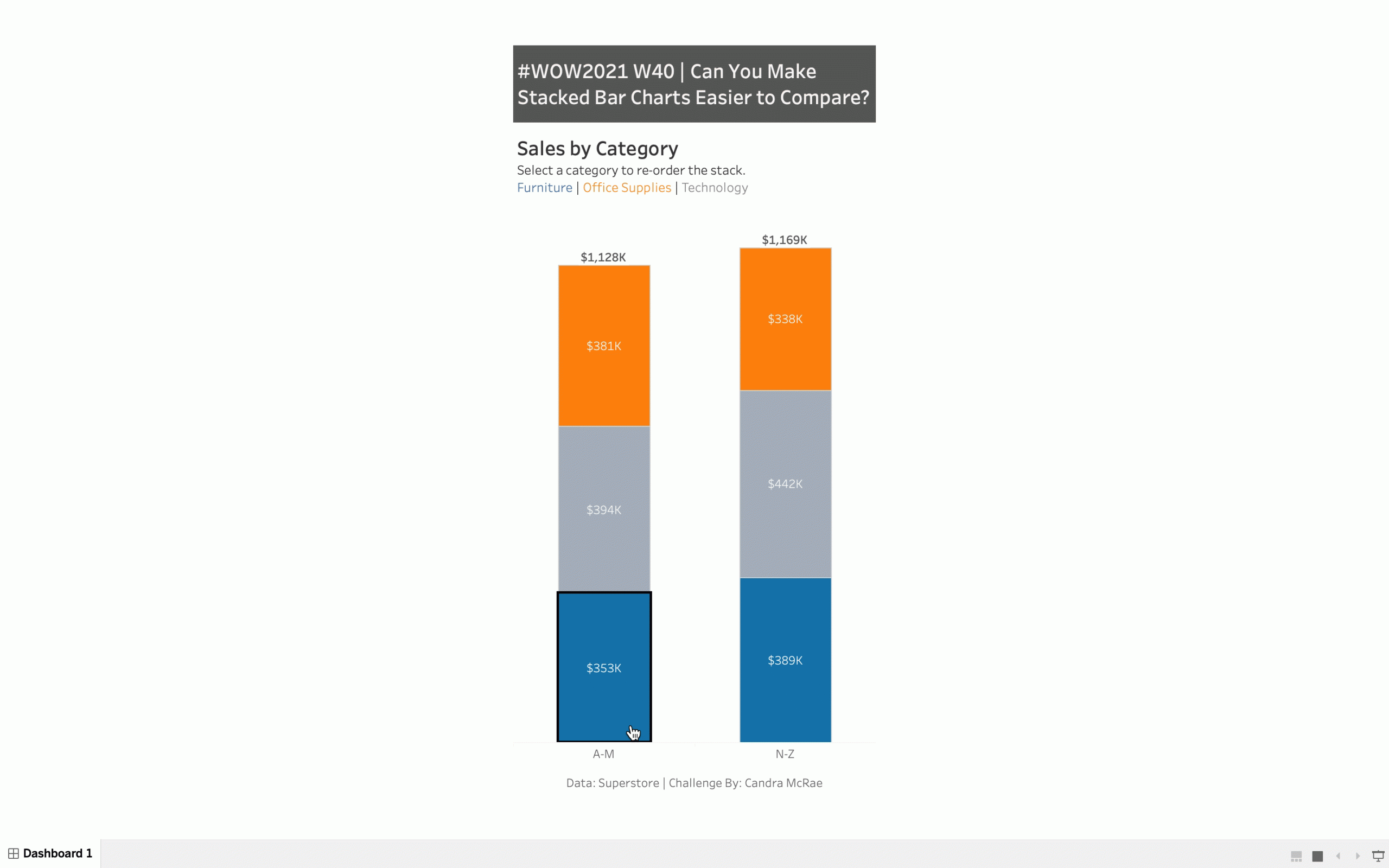
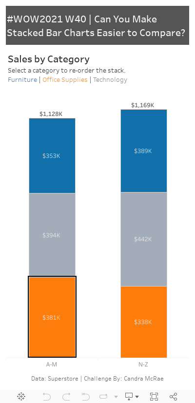
I have a confession to make…I like stacked bar charts. Someone once referred to them as rectangular pie charts, which stung a little bit – so I’ve kept my affinity quiet. Stacked bar charts get a bad rap because it can be hard to compare the different components – in fact the only one that is easy to compare is the bottom component. But, they’re so darn efficient. So, how do I show some love to a long-time friend (like I’ve been making stacked bar charts since Cash Money was taking over for the ’99 and the 2000….IYKYK).
Create a vertical stacked bar chart (sales by category) that switches the selected category to the bottom
Compare states that begin with the letters A-M vs. N-Z
Cannot use long if statements like (e.g., don’t have 26 startswith functions for every letter in the alphabet… Keep itshort and sweet – two lines max. I got this technique from a twitter post that Rody Zakovich made that was just so clever.
Non-selected bar components should not be greyed out if something else is highlighted
No drop down menus
Match the Formatting
Dataset
This week uses the superstore dataset for Tableau 2021.2. You can get it here at data.world
Attribute
When you publish your solution on Tableau Public make sure to take the time and include a link to the original inspiration. Also include the hashtag #WOW2021 in your description to make it searchable!
States column is not present in this dataset. Please update