2023 Week 30 | Dynamic Table Columns
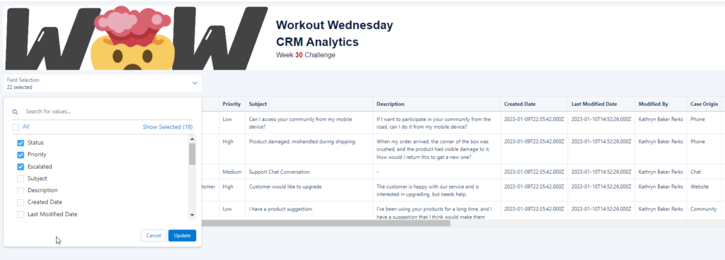
Introduction Have you ever worked with multiple stakeholders – who all want a dashboard about the same topic – but want different sets of data displayed? To reduce duplication of dashboards but to also ensure we can provide the best user experience we can provide an option for them to pick and choose which fields […]
2023 Week 30 | Dynamic Table Columns Read More »