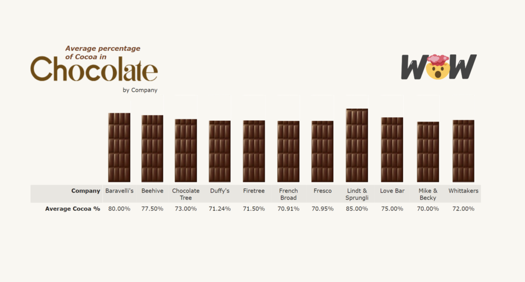
Advanced

2022 Week 26 | Power BI: Polar Plots with Charticulator

Introduction June is Music Month and this week we are getting arty with Charticulator. In our previous Charticulator challenges, we designed with cartesian plots, spiral plots and tried our hand at nested charts. For this challenge we use a Polar Scaffold to visualise songs segments by time/duration.   This challenge presumes some Power Query experience. …

2022 Week 26 | Power BI: Polar Plots with Charticulator Read More

2022 Week 20 | Power BI: Pie Matrix Tableau Redo

Introduction May is Tableau Redo month and this week we will be recreating Tableau #WoW2019 Week 45 by Luke Stanke.   Requirements Filter the data up until November 6th, 2021. Create a matrix showing region and last 7 days (up to November 6th, 2021). Create SVG Measures to build a doughnut chart that shows the …

2022 Week 20 | Power BI: Pie Matrix Tableau Redo Read More

2022 Week 15 | Power BI: March Madness

Introduction For basketball fans in the United States, March is a special time.  It is when 64 of the best college basketball teams match up in a single elimination tournament to see who is the NCAA Men’s Basketball champion.  The early rounds of the tournament provide long days of basketball games across several TV stations.  …

2022 Week 15 | Power BI: March Madness Read More

Power BI Report containing Demeb bullet charts

2022 Week 13 | Power BI: Build a Bullet Chart with Deneb

Introduction For this last week of March, we are continuing our project management theme.  The challenge this week is to use Deneb to build bullet charts using the provided data. Bullet charts were created by Stephen Few to offer an alternative to clunky gauges. Bullet charts are used to compare a featured measure to one or …

2022 Week 13 | Power BI: Build a Bullet Chart with Deneb Read More

Week 05 2022 Challenge

2022 Week 05 | Power BI: Can you make a Nested Chart with Charticulator?

Introduction This week we are familiarising ourselves with Charticulator and Nested Charts. This graph was inspired by Gus Wezerek and Sara Chodosh’s chart for NYT Opinion. Requirements Download the data and remove all columns excepting the Date field, New Cases Smoothed Field and Location (save as csv) Create a second csv with only Location = …

2022 Week 05 | Power BI: Can you make a Nested Chart with Charticulator? Read More

A power bi report that calculates contrast ratio between two colors

2021 Week 46 | Power BI: Create a Color Contrast Calculator

Introduction This week we are continuing our design theme by making a report about report design. Color is a very important element in report design. Color contrast is not only important for accessibility, it’s also an element of visual hierarchy. You can also use color contrast as a way to make elements on your report …

2021 Week 46 | Power BI: Create a Color Contrast Calculator Read More

Power Bi report with a line chart and map

2021 Week 40 | Power BI: Geocoding and Maps

Introduction We have declared October to be mapping month! This month, we will focus on maps and geospatial data. There are several different maps available in Power BI as default and custom (AppSource) visuals. This week we are going to start off simple and use the Map visual to make a bubble map.  When visualizing …

2021 Week 40 | Power BI: Geocoding and Maps Read More

Workout Wednesday Power BI Week 34 2021

2021 Week 34 | Power BI: Building a Network Diagram

Introduction This week’s Workout Wednesday we will be creating a network diagram in Power BI.  Network diagrams are useful to explore relational datasets and are often used to visualize such things as project interdependencies, and social networks.  For this challenge we will be visualizing the interconnections of actors/characters of the Love Actually movie by number …

2021 Week 34 | Power BI: Building a Network Diagram Read More

Scroll to Top