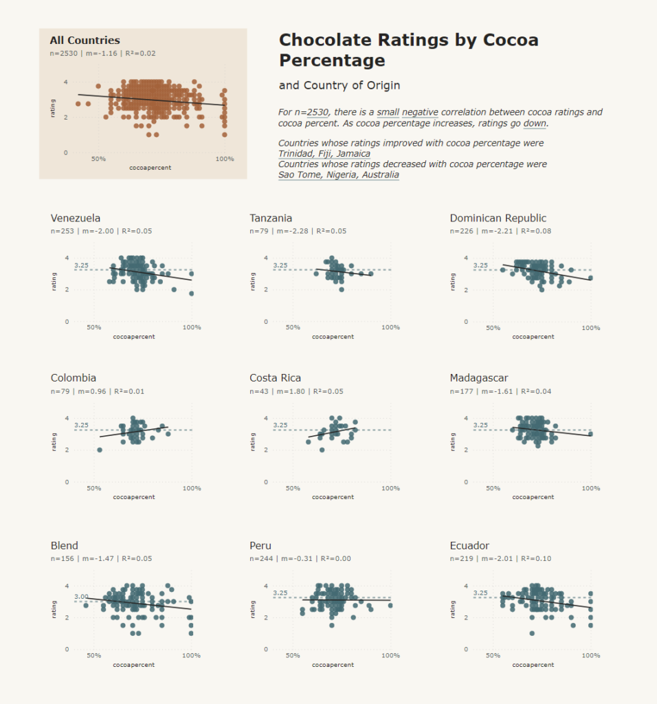
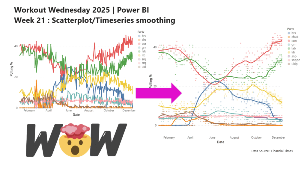
Custom Visual

Jittered Scatter Chart and Bubble Plot of Adelaide rainfall between 1183 and 2022

2023 Week 22 | Power BI: Inverted Jittered Scatter

Introduction This week’s challenge uses Deneb custom visual to create a jittered scatter with inverted axis plus a bubble plot with labels. Requirements Power Query Obtain the dataset from Australian Bureau of Meteorology Website Model and load data Power BI Desktop Option 1: Obtain Deneb Custom Visual from AppSource Create a Scatter Chart with point …

2023 Week 22 | Power BI: Inverted Jittered Scatter Read More

2023 Week 07 | Power BI: Non-linear Regression

Introduction This week for Workout Wednesday we will be trying our hand at non-linear regression with the Deneb custom visual. With Vega and Vega-Lite we can create a non-linear line of best fit over our data points and utilise the statistical API to return a correlation coefficient. Requirements Power Query Obtain the dataset from the …

2023 Week 07 | Power BI: Non-linear Regression Read More

Vertical Area Chart describing Republican and Democrat shifts in ideology

2023 Week 03 | Power BI: Vertical Area Chart

Introduction Howdy All! We’re all topsy-turvey this week turning line charts on their side! ⇩ This weeks challenge was inspired by Nick Desbarats article Are Vertical Line Charts Ever a Good Idea? Can you find some other examples where vertical line charts may be a good idea? ⋟^◕ܫ◕^⋞ Happy Vizzing Requirements Power Query Obtain the voteview_polarization_data.csv …

2023 Week 03 | Power BI: Vertical Area Chart Read More

Power BI page featuring an image carousel

2022 Week 52 | Power BI: Image Carousel

Introduction “Hot days, warm nights, beaches, backyard cricket and Christmas celebrations are all part of summer in the Southern Hemisphere.” This week we will be connecting to a public flickr photo gallery from the State Library of South Australia, to create an image carousel using a custom visual from AppSource. Requirements Power Query Connect to the …

2022 Week 52 | Power BI: Image Carousel Read More

2022 Week 46 | Power BI: My Second Deneb

Introduction During week 42’s community month challenge brought to us by Thys van der Westhuizen – Thys built on my week 37 challenge – My First Deneb. For that week’s challenge I built out three basic bar charts using Deneb visuals, and subsequently, Thys continued to build a few more amazing visuals in his challenge. …

2022 Week 46 | Power BI: My Second Deneb Read More

How Brits met their partners

2022 Week 45 | Power BI: Ribbon Chart (Advanced)

Introduction Another Deneb visual this week – creating a custom Ribbon Chart.   This ribbon chart takes on a slightly different form than the ribbon charts you may be used to. This ribbon chart is focused on highlighting the change in rank and proportion of response types between the first and last dates of a …

2022 Week 45 | Power BI: Ribbon Chart (Advanced) Read More

2022 Week 42 | Power BI: Deneb Custom Visuals

Introduction I was recently asked by Rob Saunders if I would like to assist with a #WorkoutWednesday PowerBI challenge. To be seen in the same crowd with Kerry, Shannon, Meagan, Spencer, and Rob is such an honour. Cue the onset of imposter syndrome. After that feeling passed, Rob and I decided to continue with the …

2022 Week 42 | Power BI: Deneb Custom Visuals Read More

2022 Week 37 | Power BI: My First Deneb

Introduction I sit back every week and watch the other amazing members of the #WorkoutWednesday Power BI team go through Deneb challenges like it’s nothing. The visuals are fantastic, the customizations are intriguing, but the truth is – I’ve never done a Deneb visual! Until this week that is.    If you’re like me and …

2022 Week 37 | Power BI: My First Deneb Read More

2022 Week 36 | Power BI: Split Violin Plot and HTML

Introduction Another PlotlyJS visual this week – creating a split violin plot. We’ll be comparing male and female dating preferences collected from speed dating events between 2002-2004. EXTRA CREDIT – For those with a little more time on their hands, an extended workout challenge is included; conduct your own data analysis and create a data …

2022 Week 36 | Power BI: Split Violin Plot and HTML Read More

Scroll to Top