2025 Week 34 | Sigma: Let’s Request Some Data Changes
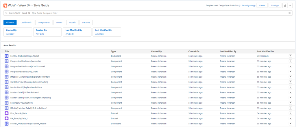
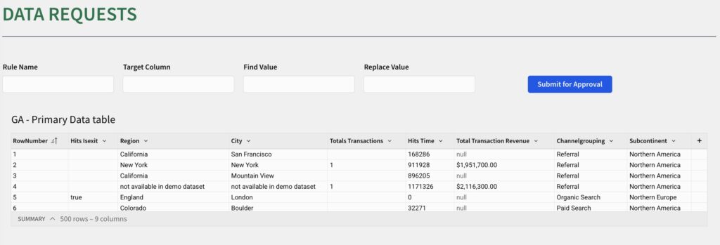
Can you create a data request and approval app? Introduction This week, we’re moving beyond analysis and into data apps. We’re going to solve one of the most persistent problems in any data-driven organization: data quality. The challenge isn’t just to clean data. It’s to build a complete, self-service system that empowers your business users …
2025 Week 34 | Sigma: Let’s Request Some Data Changes Read More