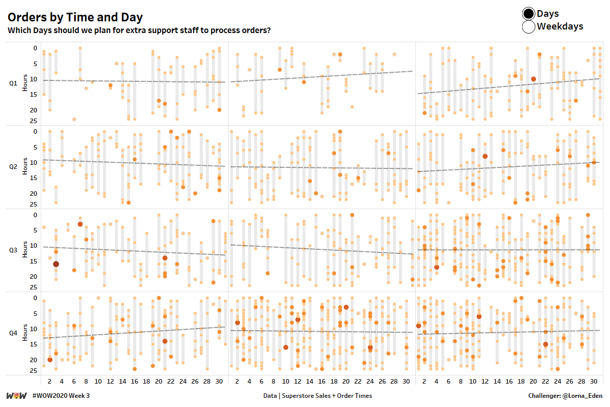
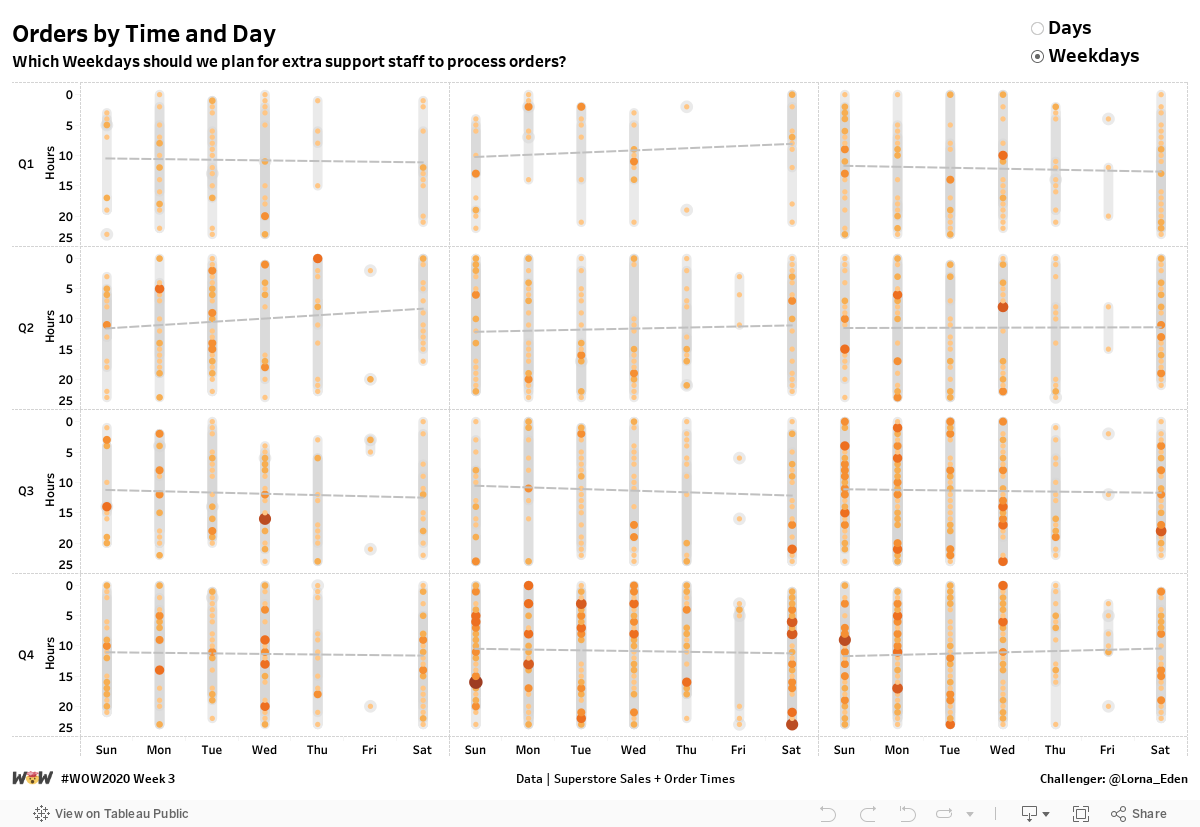
This week, I wanted to take a look at how people could visualise time in a unique way. My idea around this is planning. Looking at time in this manner allows people to look at workload / order load etc and see where was most and least popular, which will allow planning for the workforce or other elements.
Ability to switch between day numbers and weekdays
Small Multiple by month. No hard coding of months or table calcs
Filter to latest year
Show the range of Hours that orders were placed
Show the number of orders placed on a particular hour
Match Tooltips and Formating
Dataset
This week uses the superstore dataset for Tableau 2019.4. You can get it here at data.world.
There is a secondary data set which you are required to join to. You can get it here at data.world
Attribute
When you publish your solution on Tableau Public make sure to take the time and include a link to the original inspiration. Also include the hashtag #WOW2020 in your description to make it searchable!

Hi Lorna,
here’s my shot. I had to do it twice because i did’nt look at the x-axys labels at first… 🙁
Here’s my shot: https://public.tableau.com/profile/marcodegola#!/vizhome/WorkoutWednesday2020Q1/W03