Month: June 2021

Power Bi 2021 week 26 showing a histogram with 8 even bins

2021 Week 26 | Power BI: Make a Histogram with Equal Size Bins

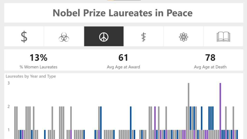
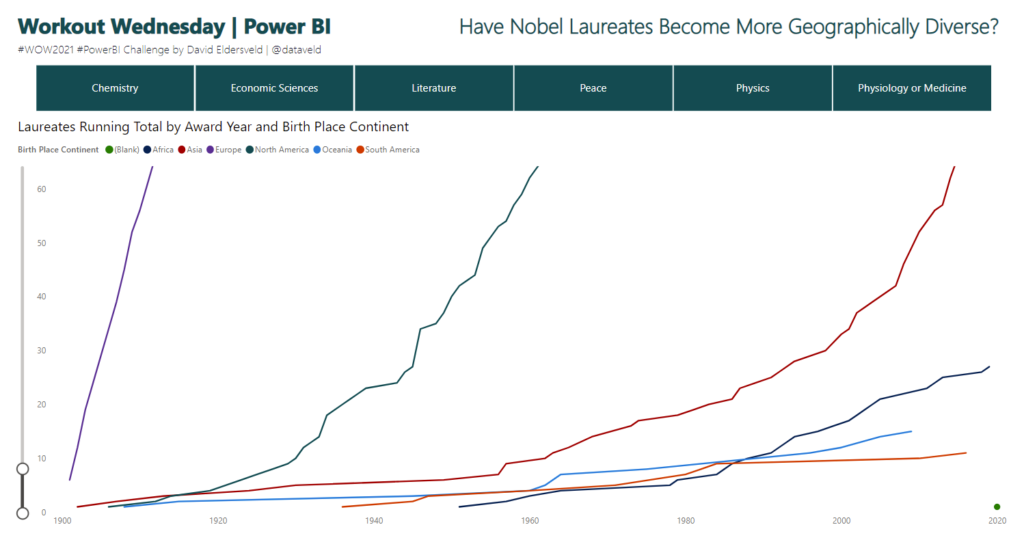
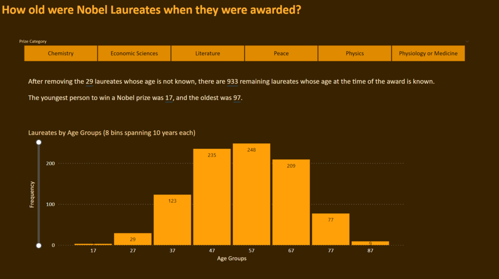
Introduction This is our last week using the Nobel Prize data. We are again looking at the age of the laureate when they were awarded the prize. This time we will examine it using a histogram. Histograms measure the distribution of data within defined ranges. So we are calculating age and creating bins of equal …

2021 Week 26 | Power BI: Make a Histogram with Equal Size Bins Read More

2021 Week 26 – Tableau: Profitability with Dual Axis Charts

Introduction This week we are going to do two things:  look at alternative for the most common scatterplot I see in Tableau. use a very uncommon unsynchronized dual axis chart. First, the chart I always run into is this scatterplot of total sales and total profit by order. While we can see which orders were …

2021 Week 26 – Tableau: Profitability with Dual Axis Charts Read More

2021 Week 25 | Power BI: Unicode Characters

Introduction This week we are building on Meagan and David’s challenges using the Nobel Prize data. We’re also continuing on our customization journey and will have a bit of fun using unicode values. Unicode is a standard numeric value that represents a character, which can easily be transformed into a character in Power BI using a bit …

2021 Week 25 | Power BI: Unicode Characters Read More

Isotype visual showing female Nobel prize winners

2021 Week 24 | Power BI: Create an Isotype Visualization

Introduction This week we are continuing with the Nobel laureates data and taking a look at gender diversity of Nobel laureates. We’ll do this by using an isotype visualization. Isotype visuals use an icon that is related to the subject matter being depicted and often use multiples to represent quantitative data. You can learn more about …

2021 Week 24 | Power BI: Create an Isotype Visualization Read More

2021 Week 24 | Tableau: Can you visualise the Cholera Outbreak?

Introduction How is it that time of the week already? This week I have a challenge for you which hones in on some of the Map Layers and Spatial Calculations. It is using a dataset recreated by a colleague of mine Dan Farmer as he posted a similar visualisation internally. Thanks for the inspiration Dan. …

2021 Week 24 | Tableau: Can you visualise the Cholera Outbreak? Read More

2021 Week 23 | Tableau: Sales Goal Selection Tool

Introduction This week’s challenge is inspired by a recent situation I encountered.  The dashboard users had two different ways to calculate a goal and wanted the option to change how the calculation works for each category.  Not only that, they wanted to be able to take the mixed calculations and sum them up to get …

2021 Week 23 | Tableau: Sales Goal Selection Tool Read More

Workout Wednesday Power BI Week 23 2021 Nobel Prize

2021 Week 23 | Power BI: Can You Build a Cumulative Line Chart?

Introduction Continuing with the Nobel Prize data that Meagan began exploring last week, this week extends to consider aspects of individual Nobel laureates. The main visual is a cumulative line chart, but you’ll also provide detail on laureates with a report page tooltip. While additional JSON expansion and transformation was required from the original dataset, …

2021 Week 23 | Power BI: Can You Build a Cumulative Line Chart? Read More

2021 Week 22 | Power BI: Create Your Own Timeline from JSON Data

Introduction Workout Wednesdays for Power BI is now in our sixth month! Thanks so much for joining us. For the month of June, we will have independent exercises that all use the same data source but focus on different aspects of the data and of Power BI. Our dataset for the month comes from Nobelprize.org. …

2021 Week 22 | Power BI: Create Your Own Timeline from JSON Data Read More

#WOW2021 week 22: Can You Structure the Unstructured?

Introduction Data analyst is supposedly the sexiest job of the 21st century.  Most people think that we spend our time building amazing models, visualizations, or insights all day.  What they don’t know is that you spend nearly most of your time cleaning data.  Some data is nice and refined (aka usable) and other data needs …

#WOW2021 week 22: Can You Structure the Unstructured? Read More

Scroll to Top