Introduction
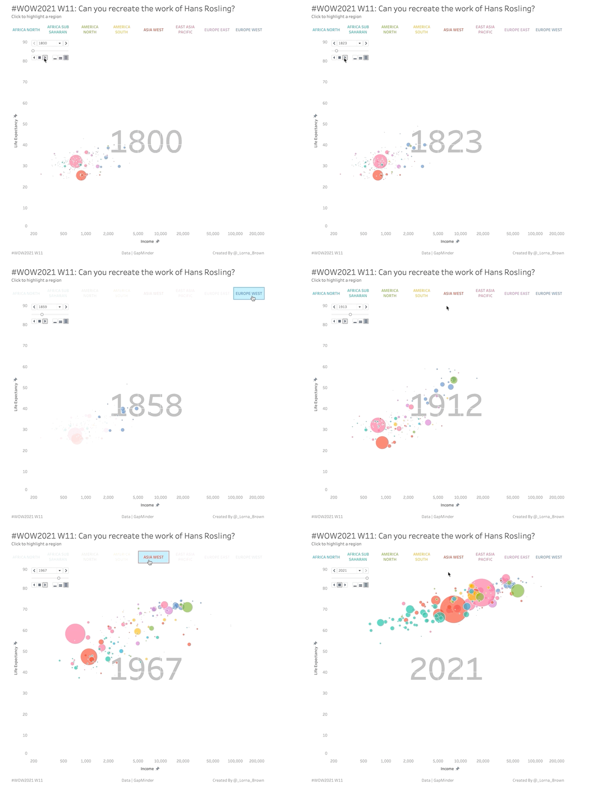
This week I wanted to throw it back to an old classic chart by Hans Rosling, if you haven’t seen the TED talk I highly recommend watching it. Hans shows how fertility rate and life expectancy has changed over the years. With this example we are going to look at Income per GDP and life expectancy. The key to getting this challenge correct is the data prep and relationships in Tableau Desktop.
Requirements
- Dashboard Size: 800px by 800 px
- # of Sheets – up to you
- Relate all four data sets together using Country and Year
- hint you’ll need to pivot
- Create a scatter plot showing Life Expectancy and Income per GPD, sized by population
- Use the pages shelf to show a single year at a time
Dataset
This week uses data from GapMinder. But for ease you can find all four needed on Data.World
Attribute
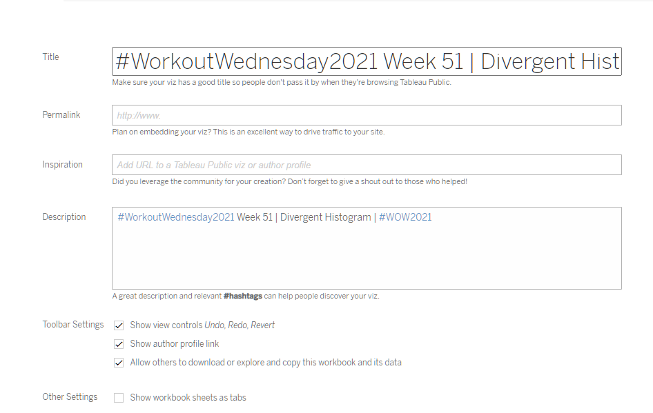
When you publish your solution on Tableau Public make sure to take the time and include a link to the original inspiration. Also include the hashtag #WOW2021 in your description to make it searchable!

Share
After you finish your workout, share on Twitter using the hashtag #WOW2021 and tag @AnnUJackson, @ItsCandraM, @LukeStanke, @_Lorna_Brown and @HipsterVizNinja

Hi Lorna
Very nice visualization .
Can you share the solution.
Thanks
Anamika
Hi! Can you please post a video/steps on how to prepare data for this viz.?