Introduction
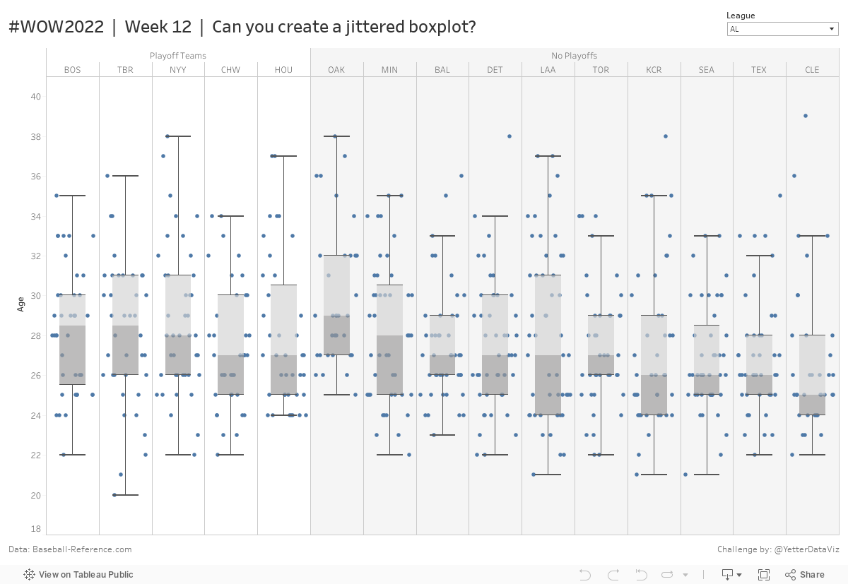
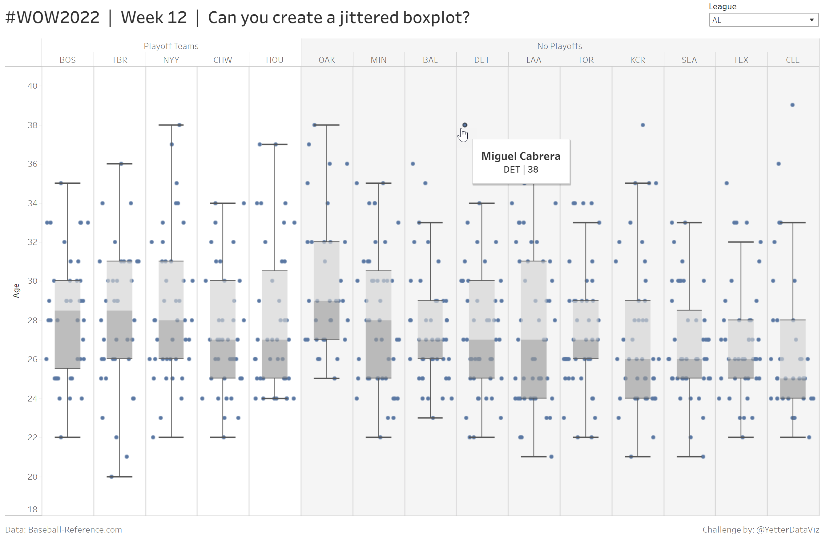
Last week a colleague reached out for help creating a boxplot to look at age distribution for different subscription methods, and my first thought was, “I know how to do that, but I don’t remember how to do that.” So I went back to find one I had made previously, and we were able to figure it out, as it was fairly simple. Boxplots can be simple to build, if you know where to put things. So this week we’ll practice building a boxplot.
Early in my Tableau journey, I came across some blog posts (here and here) from a couple Tableau legends, Jeffrey Shaffer and Steve Wexler (2 of the 3 authors of the Big Book of Dashboards), talking about “jitter.” Steve actually has 4 separate blog posts about jitterplots, and they’re all fantastic. But there is definitely something to seeing the distribution spread out in addition to a boxplot, instead of having a bunch of dots stacked on top of each other in a single column. So this week we’re more specifically practicing a jittered boxplot.
I wanted to focus on the fundamentals, so I didn’t want a huge dataset. Since Major League Baseball is back this week, I decided to look at age distribution by team for 2021 (with a little bonus of whether teams made the playoffs or not).
Requirements
- Dashboard Size: 1200 x 800px
- 1 sheet
- Connect the two data sources via relationship on Team
- Create jittered boxplots showing age distribution by team
- Group teams by whether or not they made the playoffs (1=Made Playoffs, 0=No playoffs) and shade to match
- Sort teams by Median Age
- Set a filter to switch between leagues or show all teams
- Match tooltips and formatting
Notes:
- Be sure to note the data source, as that is a specific request of the site where I sourced my data.
- For any baseball enthusiasts, if you’re not seeing a player you would expect to see (ie the biggest age outlier in MLB), they probably got traded in 2021, and for simplicity I removed those players from the dataset
Dataset
This week uses a custom data set of MLB players. You can find it here on Data.World
Attribute
When you publish your solution on Tableau Public make sure to take the time and include a link to the original inspiration. Also include the hashtag #WOW2022 in your description to make it searchable!
Share
After you finish your workout, share on Twitter using the hashtag #WOW2022 and tag @LukeStanke, @_Lorna_Brown, @HipsterVizNinja, @_hughej, and @YetterDataViz
Solution
Interactive