
Introduction
This week’s challenge is inspired by one of the dashboards in The Big Book of Dashboards, by Steve Wexler, Jeffrey Shaffer, and Andy Cotgreave. If you’re not familiar with it, the BBOD is a tremendous resource of tools and concepts you can apply to real world business scenarios, and you can learn more at https://www.bigbookofdashboards.com/.
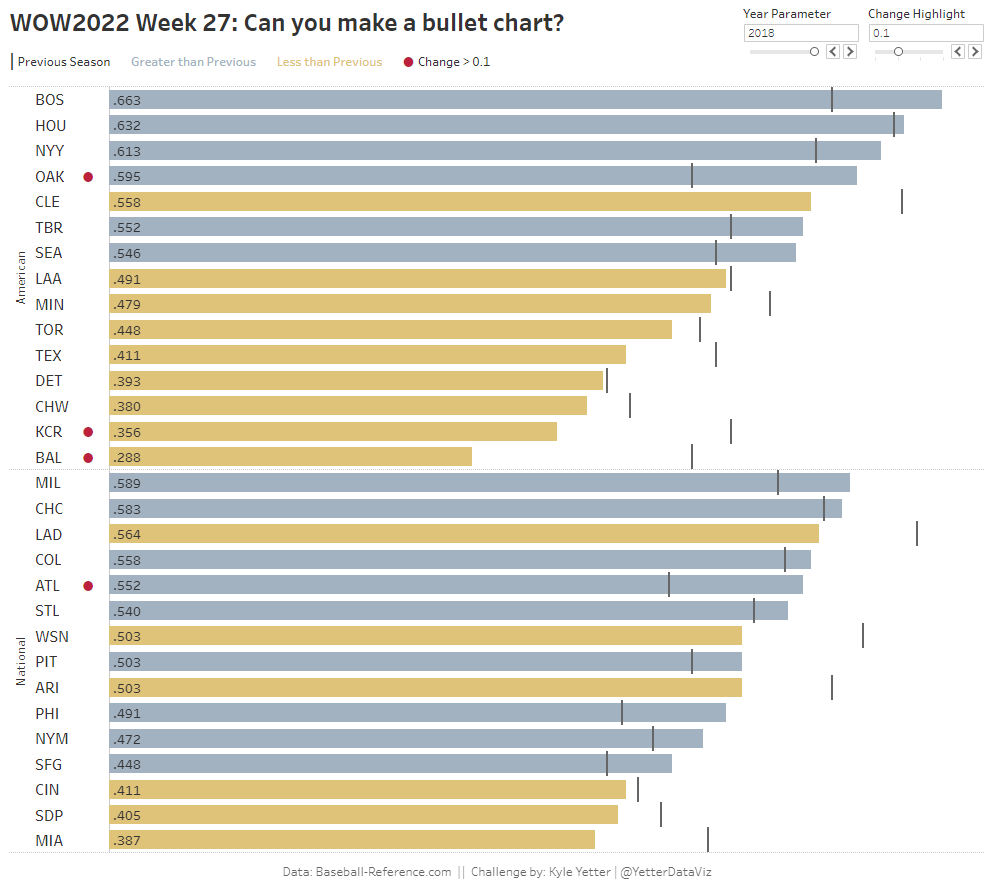
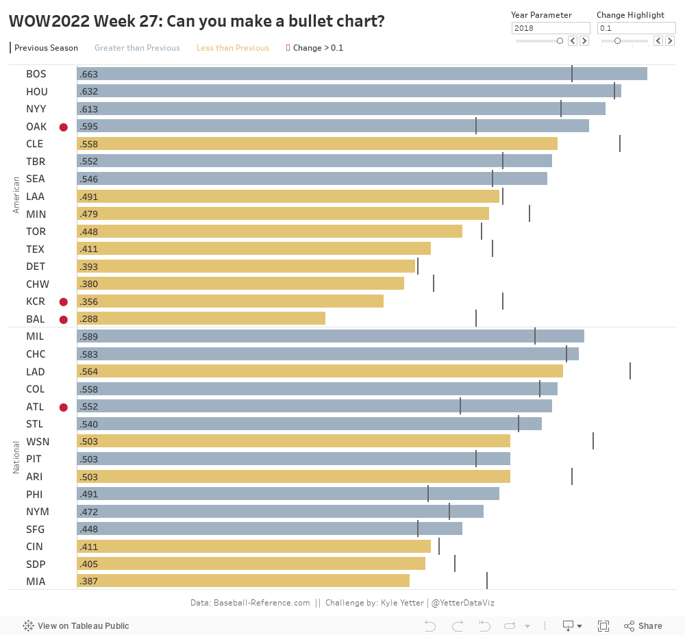
The chart itself is a Bullet Chart, and I find myself using these quite often as I work with comparison to budget or forecast in our finance team. In this case, we’ll compare this year’s results to last year’s, but you could just as easily do it by month or quarter (as in the BBOD example). One additional element in this case is a red dot highlighting any rows where the change is greater than a certain level. This can be very useful to quickly identify those areas that have had drastic change from one period to the next, either positive or negative.
I tried to mix it up with some NBA (basketball) data this week, but the multi-year seasons (i.e., 2021-22) weren’t conducive to the example. So, we’re looking at historical winning percentage by year for Major League Baseball teams. 😊
Requirements
- Dashboard Size: 1000 x 900
- Create a bar chart showing winning percentage (wins/games) by team for a given year (selected by a parameter)
- Add a line for each bar showing winning percentage for the year prior to the selected year
- Bars should be colored by whether the winning percentage was greater than (#a0b2c2) or less than (#e3c475) the prior year
- Bars should be sorted by winning percentage, descending, by league
- If the change from prior year is larger than a selected value (parameter-based), a red dot should appear between the team label and the bar
- Viz in tooltip should show historical win percentage for that team (line color matching bar), with a reference line of the selected year and min/max points labelled
- Match formatting and legends
Dataset
This week uses a franchise wins dataset from Baseball-Reference.com. You can get it from data.world here.
Attribute
When you publish your solution on Tableau Public make sure to take the time and include a link to the original inspiration. Also include the hashtag #WOW2022 in your description to make it searchable!
Share
After you finish your workout, share on Twitter using the hashtag #WOW2022 and tag @LukeStanke, @_Lorna_Brown, @HipsterVizNinja, @_hughej, and @YetterDataViz
Solution
Interactive
I used row level calculation instead of LOD. Everything can done with row level calculation except the line chart color. I should think about this with LOD first, thanks!