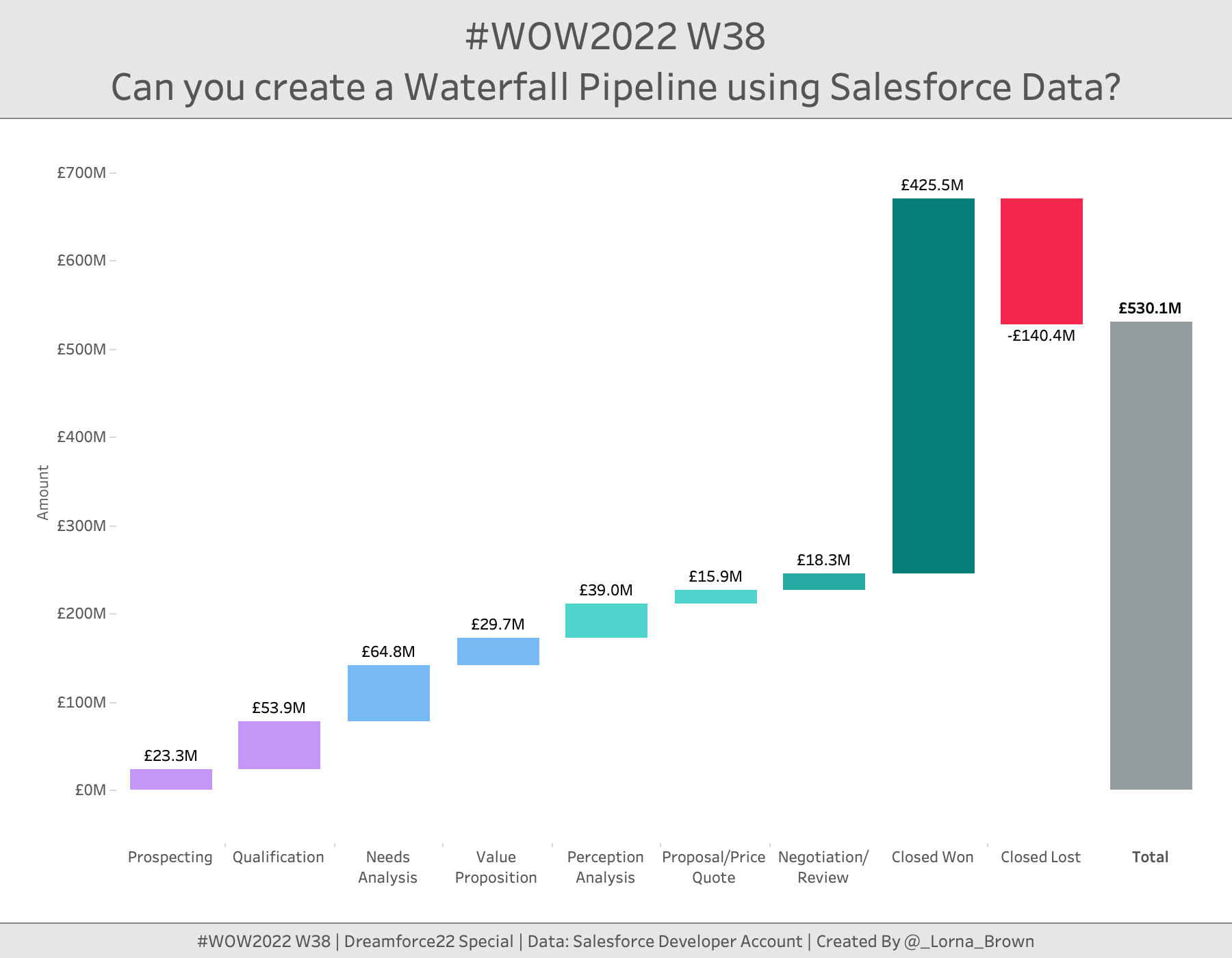
This week is Dreamforce; Salesforce’s conference. So I thought I would stay on theme and use Salesforce Data. When I first started to see Salesforce pre-built dashboards they included several elements, but the one we are going to focus on today is the Waterfall chart. This allows us to see how much value is within each stage of the opportunity lifecycle.
This workout can be done in Tableau, PowerBI or CRM Analytics.
Create calculations that changes any Closed Lost opportunities to a Negative amount
Create a waterfall chart which shows a running total, the difference and where the values are negative.
Also make sure you have the total
Match all formatting
Dataset
This week requires you to sign up for a salesforce developer account which you can do here.
If you are using Tableau Public, please download the data set from here
Attribute
When you publish your solution on Tableau Public make sure to take the time and include a link to the original inspiration. Also include the hashtag #WOW2022 in your description to make it searchable!