Last week, our team was faced with an unique challenge and I’m using it as the basis for this week’s challenge!
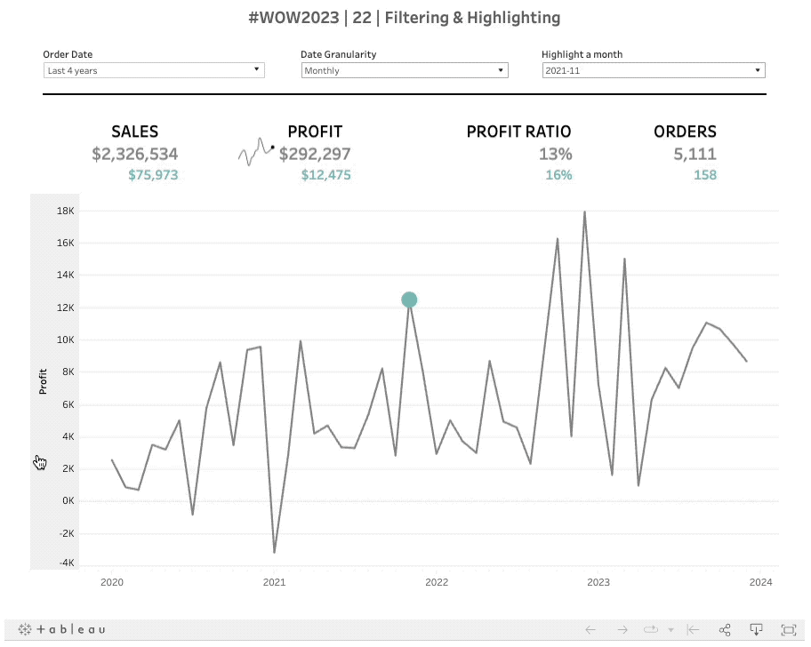
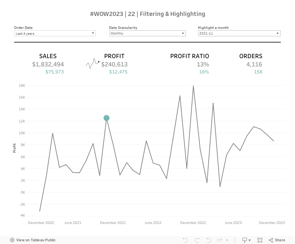
The premise is quite simple – create a dashboard that shows KPIs and a trend of the selected kpi. Allow the user to filter dates, change the period type and select a period within that type. The selected period values should be shown in KPIs vs total as well as highlighted on the trend chart.
Simple enough, right? Not that outlandish of a request. Let’s have some fun this week 🙂
Show KPIs (Sales, Profit, Profit Ratio, and # of Orders)
Total Value of date range
Selected time period value
Allow user to dynamically select which KPI shows in the trend
Show trend line of selected KPI for the selected date range
Highlight selected time period on the trend line
HAVE FUN!
Dataset
This week uses Superstore data set. You can find it here on Data.World
Optional image to show selected KPI
You can add this image to show the selected KPI if you’d like.
Attribute
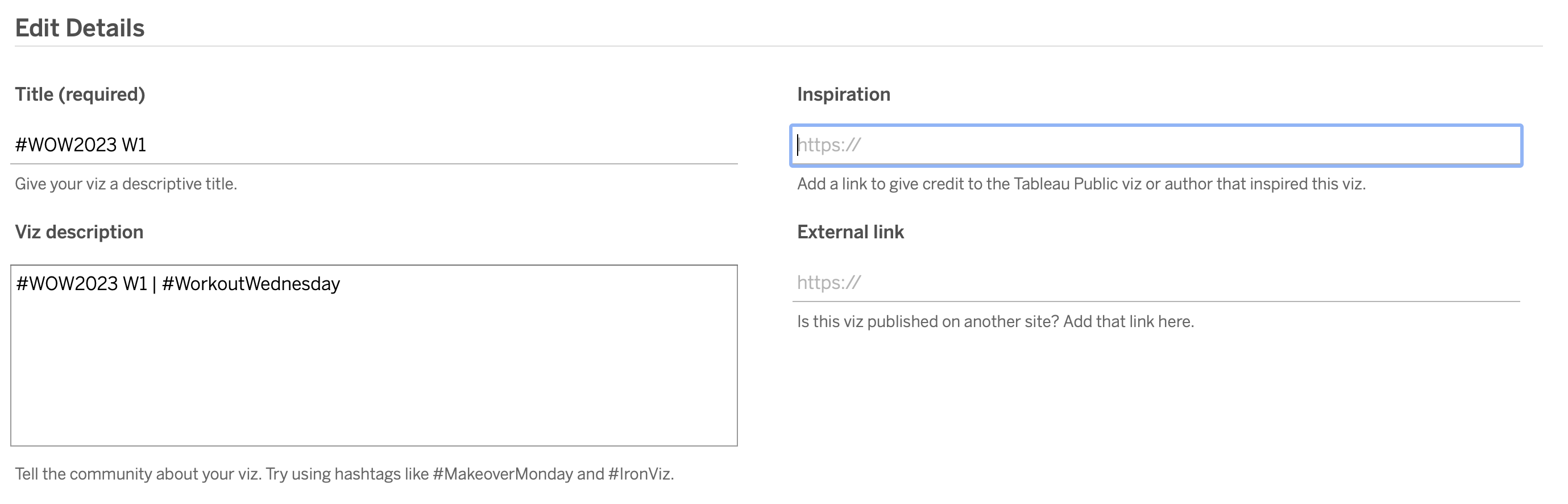
When you publish your solution on Tableau Public make sure to take the time and include a link to the original inspiration. Also include the hashtag #WOW2023 in your description to make it searchable!