Introduction
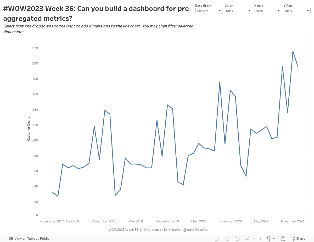
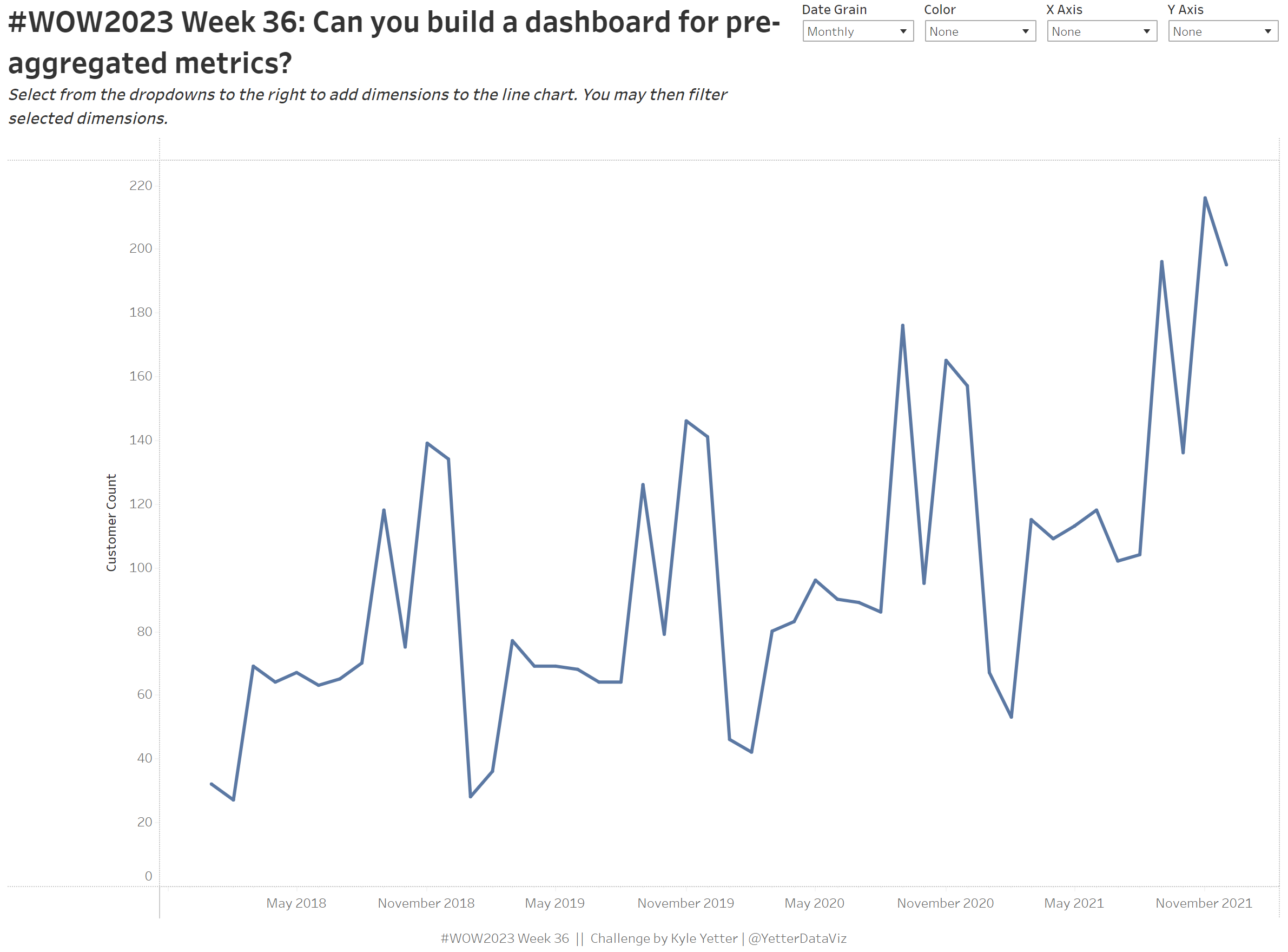
Recently, I needed to build a dashboard from some pre-aggregated, segmented data counting unique users. This created some difficulty, because we may want to look at overall numbers, or one segment, or multiple segments, and that changes the user counts. Each of these have their own level of aggregation in the data, so it takes a bit more work to show the right combination of segments. This challenge is a variation of that solution.
I encourage you to look at the data set to get an understanding of the structure. For each month or year, you have an overall customer count (Region, Category, Segment are null), a customer count for Region (Category and Segment are null), etc.
Requirements
- Dashboard Size: 1200 x 900
- 1 sheet
- Allow the end user to select Monthly or Yearly date grain, and filter data accordingly
- Allow the end user to select Category, Region, Segment, or None for Color, X Axis, or Y Axis
- When one is selected, the respective filter should appear (without Null as an option)
- When None is chosen, ‘Null’ labels should not appear
- There should be no Null values showing (in color or axes) when Category, Region, or Segment has been selected. You’ll need to filter those out.
- Match formatting/tooltips
Dataset
This week uses an aggregated Superstore data set. You can find it here on Data.World
Attribute
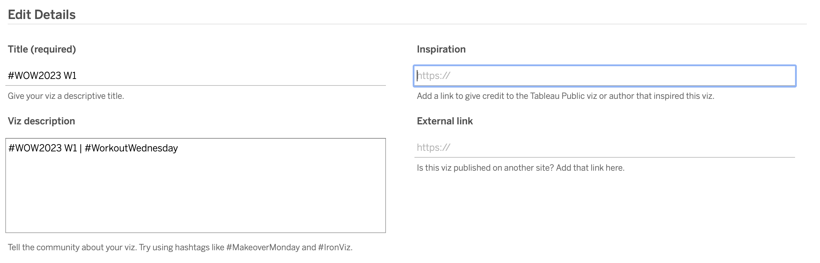
When you publish your solution on Tableau Public make sure to take the time and include a link to the original inspiration. Also include the hashtag #WOW2023 in your description to make it searchable!
Share
After you finish your workout, share on Twitter and/or LinkedIn using the hashtag #WOW2023 #Tableau and tag @WorkoutWednsday
Solution
Interactive