Introduction
November is a special month. Workout Wednesday is viewed by thousands of people each week across the globe. And this month we are highlighting those across the world who have great ideas and concepts to share with others. First up is Venkatesh Iyer. Its his second time hosting this year, but if you’ve read any of his content, Venkatesh offers unique solutions that “just work”.
Here’s his challenge:
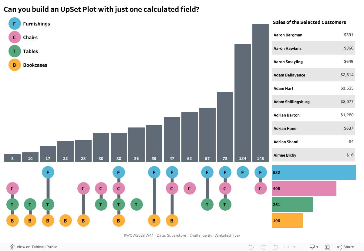
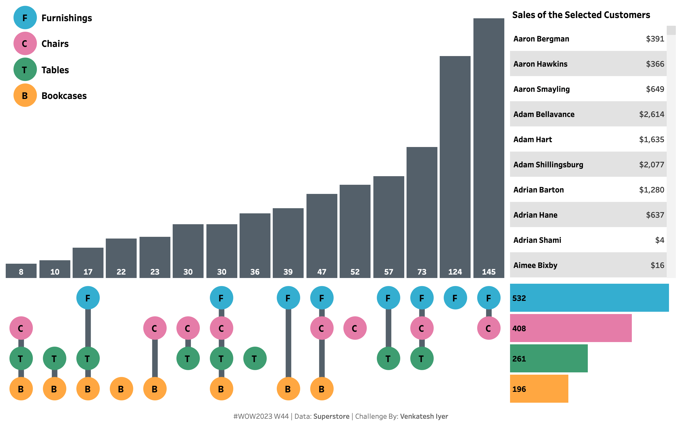
As a data analyst, you might have probably come across a situation where you felt that you need a Venn/Euler diagram to visualize the data in the best possible way. There are 2 blockers that stand in your way when you try to do this. Firstly, it takes a lot of effort to create a Venn/Euler diagram with even 2 sets in Tableau. This becomes exponentially more difficult when 3 sets are involved. The second blocker rears its head the moment you dive into the realm of Venn/Euler diagrams with more than 3 sets. It is not possible to create a Venn diagram (or an Euler diagram with 13+ sections) with 4 intersecting circles, as there are not enough sections to represent all possible combinations! This will defeat the whole purpose of using this data visualization technique. Technically, there are ways to visually represent this with all sections using 4 ellipses instead of circles. However, this will be prohibitively hard to implement in Tableau, and will tremendously increase the cognitive load for users. Now imagine this with 5 ellipses.
Fortunately, there is a clever and underrated way to visualize more than 3 intersecting sets. Clever because it solves all the aforementioned problems while also making it very easy for users to compare different sections. Underrated because 8/10 people I show this to have not seen it before. The data visualization technique I am referring to is the UpSet plot. The challenge, as you might have guessed, is to build one in Tableau.
Requirements
- Dashboard Size: 1200 x 800 px
- Sheets: 5
- Custom Calculations: 1
- Filter the category to only Furniture
- Features: The UpSet plot must show the different combinations of the number of customers who purchased from the 4 sub-categories of the Furniture category. By default, the table on the top right should show the sales for all the customers. But when one of the bars from either the horizontal or vertical bar chart is clicked, it will show the sales for all the customers from that cohort.
- At least 1 sheet
Dataset
This week uses the latest superstore dataset. You can find it here on Data.World
Attribute
When you publish your solution on Tableau Public make sure to take the time and include a link to the original inspiration. Also include the hashtag #WOW2023 in your description to make it searchable!
Share
After you finish your workout, share on Twitter and/or LinkedIn using the hashtag #WOW2023 #Tableau and tag @WorkoutWednsday
Solution
Interactive