Introduction
As you know, we’re in the middle of Diversity Month here at #WOW2023 and I’m excited to welcome Ervin Vinzon. Ervin hails from Philippines and is a Tableau User Group Ambassador. He is also an avid #WOW2023 participant. We are honored to have his challenge featured this week.
Hey there, I’m Ervin Vinzon, leading the Manila Tableau User Group. Recently, Sean offered me an exciting opportunity to be the guest coach for #WOW2023, a chance to share my Tableau knowledge with the community.
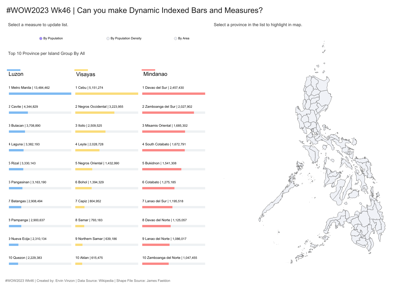
In preparation, I decided to revamp my latest visualization focused on the 2020 Philippine Population. Just a heads-up, for this viz, I’ve grouped all Manila districts into Metro Manila. When merging datasets, caution is key to avoid unintended value multiplication. This visualization highlights the use of dynamic measures, table calculations, and map layers, offering an excellent learning opportunity.

Click to open in Tableau Public
Requirements
- Dashboard size
- : 1400 x 1000
- 4 worksheets
- A Dynamic Selector that enables users to switch between measures
- Population
- Population Density
- Area
- A Bar chart that shows the top 10 provinces based on the selected measure, sorted in descending order.
- A chart title that dynamically updates based on the selected measure.
- A Dynamic Map that highlights the selected province—pay attention to the detailed highlighting.
- For Island Group color representation:
- Dynamic Map color usage:
- Dynamic Selected Measure colors:
Dataset
This week uses Superstore data set. You can find it here on Ervin’s G Drive
Attribute
When you publish your solution on Tableau Public make sure to take the time and include a link to the original inspiration. Also include the hashtag #WOW2023 in your description to make it searchable!

Share
After you finish your workout, share on Twitter and/or LinkedIn using the hashtag #WOW2023 #Tableau and tag @WorkoutWednsday and @VinzonErvin
Solution
Interactive