Introduction
We’re deep in the March Madness tournament, so what better way to celebrate than by digging into some NCAA data?
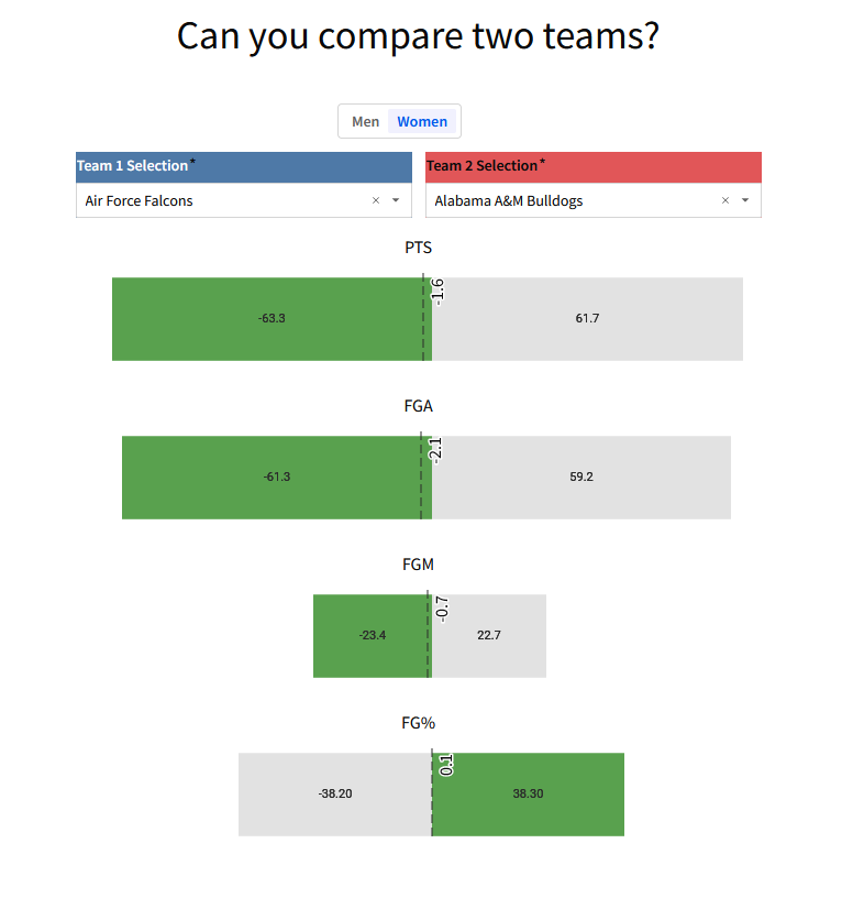
This weeks challenge is one that shows a creative way of comparing two entities based on similar stats. I’m actually not sure if there’s a better way of handling this challenge, so I would love to hear your ideas on LinkedIn if you’ve improved the design!
Need access to Sigma?
Note: You will only have view access to WOW Workbooks, Folders, and Workspaces, not edit access. Please create your WOW Workbooks under “My Documents.” We suggest creating a folder to organize all your workbooks.
Requirements
- Create two tables that union together the NCAA Men’s and NCAA Women’s datasets that are inside of this week’s challenge folder.
- NCAA Women’s Stats 03-25-2024
- NCAA Men’s Stats 03-25-2024
- You should select all fields from these datasets
- Call the tables ‘Team 1’ and ‘Team 2’, note that you can use the ‘duplicate’ functionality to save yourself some work 😉
- Limit both tables to Team, Men or Women, PTS, FGM, FGA, FG%
- In Table 1, update all of the numeric fields so they return as negative. You’ll have to update the formula in the function bar
- Controls
- Create a Segmented Control to choose whether you want to compare teams from the Women or Men’s Tournament
- Create a List Control called ‘Team 1’ selection, it should target the ‘Team’ column in the ‘Team 1’ table
- Create a List Control called ‘Team 2’ selection, it should target the ‘Team’ column in the ‘Team 2’ table
- Team Comparison Table
- Create a table that unions together the ‘Team 1’ and ‘Team 2’ tables.
- Create calculations for the ‘Max of Abs of XYZ’ for each of the numeric columns. Note these should be made in the ‘groupings’ area and should be performed on the whole table. You do not need a column to group by
- Create new columns called ‘PTS Color’, ‘FGA Color’, etc.. For each metric. The logic should be ‘Abs([PTS]) = [Max of Abs of PTS]’. Apply for each of the numeric columns
- The ‘Comparison Bars’
- There are going to be a lot of formatting steps here, so bear with me
- Create a child visualization from the ‘Team Comparison’ table you just made. You’re going to repeat this for each numeric column you want to create, but start with one and then duplicate! We’ll start with the ‘PTS’ column.
- Change the type to a ‘Bar’ and make it horizontal. Make sure it’s set to ‘Stacked’
- Add the ‘PTS’ column to the X-axis (remember, it should be horizontal!)
- Add ‘PTS Color’ to the ‘Color’ section
- Update the colors, make ‘True’ a Green, and make ‘False’ a Grey
- Go to formatting
- Change the title to ‘PTS’, Move it to the center
- X-Axis:
- Remove Axis title
- Labels
- zero guideline
- change the ‘Grid Line’ to ‘Hide’
- Update the ‘Axis Range’ to be between -100 and 100
- Hide the legend
- Turn on data labels, I changed the color to black and Font Size to 24
- Reference Marks:
- Add a reference line that is the ‘Sum PTS’
- Check ‘Show Value’, and position it at the Top Right
- Increase Font Size to 16
- Change the Line to ‘Dashed’
- Duplicate the ‘PTS Comparison’ Bar Chart, and swap out the following to make it an ‘FGA Comparison’
- Change the X-axis Field
- Change the Category
- Change the Reference Mark
- The layout and formatting
- I’m not going to go through everything here, but one thing to note is that I hid the title on the ‘Men or Women’ Segmented Control
- Under the ‘Workbook settings’ Cogwheel at the bottom left of your workbook, Change the Layout Style by deselecting ‘Show Cards’ and updating the spacing to ‘Small’
Dataset
We’re using actual datasets in this challenge, they’re inside the Challenge Folder
Note: This data is a static pull as of March 25, 2024
Share
After you finish your workout, share on LinkedIn, Sigma’s Community page, (or Twitter) using the hashtags #WOW2024 and #SigmaComputing, and tag Ashley Bennett, Eric Heidbreder, and Katrina Menne!
Also, make sure to fill out the Submission Tracker so that we can count you as a participant this week to track our participation throughout the year.


