Introduction
This week kicks off our Community Month, where we invite folks from the Tableau community to create a challenge. First up is Jack Hineman, frequent WOW participant and Tableau Social Ambassador:
I am so excited to be participating in Community Month for #WorkoutWednesday. I have been a weekly participant in #WOW challenges for the past 3 years, and I am humbled and excited to be able to create a challenge myself. If you have seen any of my more recent non #WOW challenges, you would know that I have been a big fan of Map Layers recently. The feature allows for almost infinite possibilities (Just check out Jessica Moon’s Tableau Public profile if you don’t believe me). Many of the use cases for Map Layers are novelties, but I want to highlight a real-world application of Map Layers.
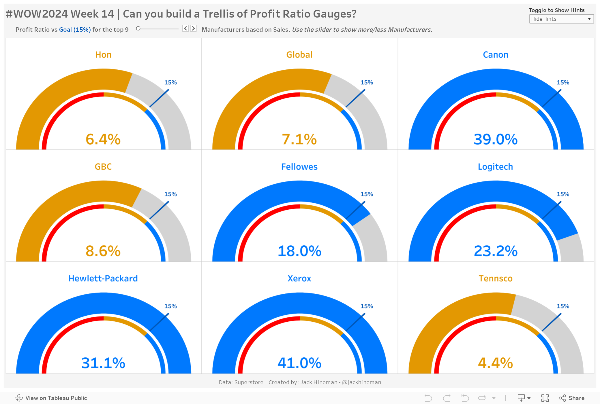
I was recently asked to create various gauges at work to reflect our performance vs different KPIs. So we are going to create Profit Ratio gauges to reflect Actual vs a Goal of 15%. (These are inspired by Ken Flerlage’s NPS Gauges). If you have tried to replicate Ken’s gauges, you will know that his solution is genius, but also pretty difficult to pull off (especially if you want to create alternate ratios for failure, concern, success). I plan on creating another Tableau Public viz that will provide templates for multiple variations of this technique.
Requirements
- Dashboard Size: 1300 x 800
- Create a 3×3 Trellis Chart with the top 9 manufacturers based on Sales
- Create Gauges for each manufacturer to show Profit Ratio compared to the Goal Profit Ratio of 15%. Although there are many elements, this can be achieved in only 3 map layers with the dataset provided.
- The Legend – the thin inner ring that is always visible showing the thresholds for
- Failure (#ff0000) | Concern (#e39802) | Success (#0079fe)
- The Background – the larger grey (#d3d3d3) “background” that is under the “actual” performance on the Gauge
- The Goal Indicator – the small sliver on the actual gauge that identifies the goal (#0057b8)
- Labels – There are 3 labels on each gauge: Manufacturer name at the top of the gauge, the Goal % at the end of the Goal Indicator, and the Profit Ratio BAN that shows inside the gauge
- The BAN should show the Profit Ratio for that Manufacturer
- The Goal should show the 15% Goal
- The Actual Performance – the portion of the gauge that is filled based on Profit Ratio for the Manufacturer. It should be colored based on the thresholds defined in Gauge Definition to match the legend colors. This is the only shape that will require you to determine the angles for each point. The gauge goes from -30% to +30%, show at the end of the gauge if the % exceeds the max.
Advanced
- Allow users to Select the Top N Manufacturers based on Sales between 5-81
- Create a Dynamic Trellis Chart with a preference towards more columns instead of more rows (example, when 7 Manufacturers are shown, then 3 columns instead of 2 columns)
- At a minimum, the font size of the BAN should change based on the number of manufacturers being shown
- Goal & Manufacturer Labels should be legible regardless of the number of manufacturers being shown, but you can also make these dynamically changing
Dataset
This challenge uses some data based on Superstore as well as some point data provided. You can download it here.
Data Dictionary
Connection/Relationships:
- Manufacturers – Gauge_Definition – Gauge_Points (Connect with 1=1)
Gauge_Definition
- Gauge Success Amt = 0.15 | Profit Ratios >= 15% are successful
- Gauge Concern Amt = 0 | Profit Ratios between 0%-15% are concerning
- Gauge Start Profit Ratio = -0.3 | The Gauge Starts at -30%
- Gauge End Profit Ratio = 0.3 | The Gauge Ends at +30%
Gauge_Points
- Point_Type (Legend, Actual, Label) – identifies what area of the map the mark should go on
- Legend – the thin inner ring
- Actual – the thick portion of the gauge
- Label – 3 labels go in various locations
- Point_Segment_ID – identifies the segment within each type
- Legend (Failure, Concern, Success)
- Actual – (Actual, Background, Goal)
- Label – (Manufacturer, Goal, BAN)
- Point_Mark_Type – (Polygon,Shape) Identifies the mark type for the Segment
- PointID – (# 0-99) identifies individual points for the polygons
- Point_Arc – (In,Out) For the polygons, identifies the inner radius vs outer radius of each Point
- Point_Arc_Order – (# 0-49) The Point Order within each arc
- Point_Angle_Order – (# 0-49) The Order of Angles for each arc Angle Order 0 for each arc should be the left edge and angle Order 49 is the right edge
- Point_Angle_Rads – Angle in Radians for most marks, you will need to calculate this angle for the Actual Profit Ratio
- Point_Radius – Radius used for all points
Attribute
When you publish your solution on Tableau Public make sure to take the time and include a link to the original inspiration. Also include the hashtag #WOW2024 in your description to make it searchable!

Share
After you finish your workout, share on Twitter and/or LinkedIn using the hashtag #WOW2024 #Tableau and tag @WorkoutWednsday
Solution
Interactive