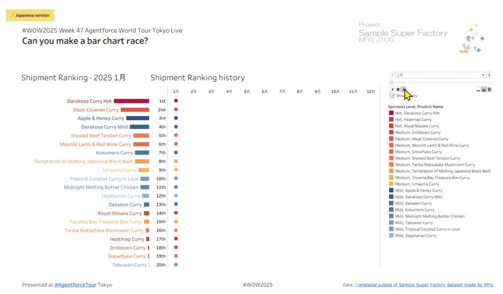
Year: 2025

2025 Week 27 | Recreate This Wealth Infographic

Introduction Recreating visuals you find online helps you build visual design skills and find workarounds to common problems or feature gaps in Power BI. This week, we are recreating this infographic from Visual Capitalist about the change in global wealth. The original is shown below, followed by my version in Power BI. Requirements Create a …

2025 Week 27 | Recreate This Wealth Infographic Read More

Screenshot of progress bars made in Power BI.

2025 Week 26 | Power BI: Progress Bars

Introduction Happy Wednesday Power BI Folks! This week on Workout Wednesday, I’m excited to be back with a fresh challenge and it’s all about progress bars! No custom visuals. No add-ons. Just creativity and some Power BI magic.  Why Progress Bars? Progress bars are a great visual tool used to represent progress toward a goal/target …

2025 Week 26 | Power BI: Progress Bars Read More

#WOW2025 Week 26: Can you create this seemingly simple line chart?

Introduction This may seem like a seeming normal line and area chart but I said “Why Tableau” numerous times when trying to create it.You want to be able to see the Top X customers per Quarter and what their percentage of total sales is. Click to open in Tableau Public Requirements Dashboard Size 800×800 1 …

#WOW2025 Week 26: Can you create this seemingly simple line chart? Read More

#WOW2025 | Week 25 | Can you make a dynamically highlighting tooltip?

Introduction Set actions came out almost 7 years ago, and only had about 3 quarters in the spotlight until parameter actions came out. Both are very powerful, but I would venture that most people (myself included) tend to use parameter actions more. So here’s your chance to give Set actions a go. Shortly after Set …

#WOW2025 | Week 25 | Can you make a dynamically highlighting tooltip? Read More

2025 Week 24 | Sigma: Do you see the difference?

Introduction Welcome to Week 24 of 2025! This week, we’re going to illustrate the difference between two of Sigma’s newer features:  Modals and Popovers.  These layout elements are very similar, but have slightly different functionality and visual differences.   Good luck! -Ashley Need access to Sigma? Click Here to Sign Up Link to WOW Sigma Instance …

2025 Week 24 | Sigma: Do you see the difference? Read More

Screenshot of a box plot created using Power BI.

2025 Week 24 | Power BI: Core Visuals Box Plot

Introduction It’s nice to be invited back by the team, and thanks for having me! While it’s tempting for me to think of something for you explore with the Deneb or HTML Content custom visuals (and I’d still encourage that!), I’d like to continue some of the other threads we’ve recently seen around what we …

2025 Week 24 | Power BI: Core Visuals Box Plot Read More

Scroll to Top