Introduction
After the results of the community survey, the top ranked feature was Table Calculations, so guess what? Let’s do some Table Calculations!
Requirements
- Dashboard 600 x 600
- ONE SHEET
- Table Calcs ONLY!
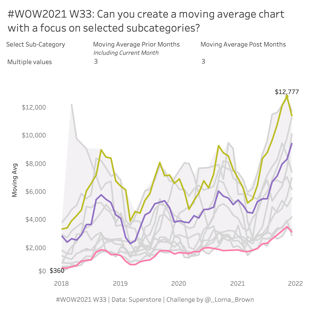
- Create a parameter controlled moving average by month for sales.
- Create a way to multi-select subcategories to bring them into focus, grey out others.
- Shade the background a light grey.
Colour Palette: Hue
Misc: Art, Envelops, Fasteners, Labels & Supplies.
Dataset
This week uses the superstore dataset for Tableau 2021.1. You can get it here at data.world
Attribute
When you publish your solution on Tableau Public make sure to take the time and include a link to the original inspiration. Also include the hashtag #WOW2021 in your description to make it searchable!

Share
After you finish your workout, share on Twitter using the hashtag #WOW2021 and tag @AnnUJackson, @ItsCandraM, @LukeStanke, @_Lorna_Brown and @HipsterVizNinja

Hi @Lorna,
thanks for the challenge. I got one thing that confuses me and honestly, I only figured by just randomly swapping the dimensions.
I pretty fast gathered the idea but for the heck of it, my lower end of the shaded area did not always fully match the window min of the lines.
I then noticed it depends on the order ob sub-category group and measure names. When i have sub-category group above measure names (first on detail, latter on color) it works perfectly but when i swap it, there is a slight misalignment. I do not understand why that is. I tried changing it to a crosstab and do the swaps there to better understand but it did not help me.
Could you kindly explain to me?
Thanks
Steffen