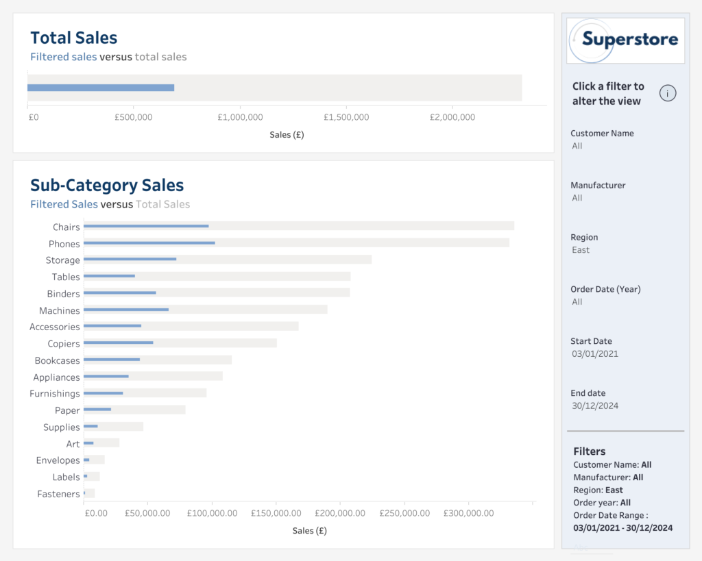
#WOW2024 | Week 23 | Manually overwrite a value in a table

Introduction This challenge started out with one idea which turned into something very different. It’s a little wacky & a little hacky, which I suppose is the essence of these challenges. The main element of this challenge became figuring out how to move a Parameter input box to a different position on the page, based …

#WOW2024 | Week 23 | Manually overwrite a value in a table Read More

2024 Week 22 – Top 4 industries + “Other”

Introduction Hello again, everyone. As data analysts, we are frequently asked to present the “Top N” group members sorted by a metric. In this blog, we’ll try to bring the top 4 accounts industries sorted by count, and group all the following members in a single “Other” bar below the top 4 ones. Requirements Create …

2024 Week 22 – Top 4 industries + “Other” Read More

2024 Week 22 | Power BI: Approximate Binned Mapping with Scatterplots

Introduction When used with care, scatterplots can be used to create symbol maps using an equidistant projected map (or Geographic or Plate Carrée) as the plot background image. Attention will need to be paid to proportions and axis scales. More information on projection types. https://en.wikipedia.org/wiki/List_of_map_projections Requirements Obtain the snowfall data from github Create new columns …

2024 Week 22 | Power BI: Approximate Binned Mapping with Scatterplots Read More

#WOW2024 | Week 22 | Can You Make a Page Navigator?

Introduction Have you ever been frustrated with unsynchronized scrollbars when placing multiple sheets on a Tableau dashboard? I own a blog about Tableau and can tell you that one of the most frequently viewed posts is about this topic.Ken’s blog post offers several solutions to this issue. A “simple” solution is to combine everything into …

#WOW2024 | Week 22 | Can You Make a Page Navigator? Read More

2024 Week 21 | Power BI: Use Slicers to Filter a Visual Based Upon a Measure

Introduction While you can’t directly populate a slicer with a measure, you can use a slicer to filter other visuals based upon measure amounts. That is what we are doing in this week’s challenge. In the report below, we have a budget analysis report. The report allows users to filter the projects table to projects …

2024 Week 21 | Power BI: Use Slicers to Filter a Visual Based Upon a Measure Read More

2024 Week 21 | Sigma: Can you set some boundaries?

Introduction This week, I was inspired by a post in the Sigma Community from Mark Ruesink that showed a really clever way to visualize outliers in Sigma using a combo chart and some clever calculations. Mark goes all the way to visualizing outliers, so I definitely recommend checking out his full post, but I wanted …

2024 Week 21 | Sigma: Can you set some boundaries? Read More

2024 Week 20 | Sigma: Can you create quadrants?

Introduction Week 20 already! Crazy how fast the year is going by…and how fast you’re skilling up in Sigma! I love scatter plots. They’re a great way to display a lot of information in an easily consumable package. Layering quadrant colors on top, make it even easier to visually group dots and find outliers.  -Katrina …

2024 Week 20 | Sigma: Can you create quadrants? Read More

Scroll to Top