2025 Week 38 | Sigma: Can You Make Some S’notes?
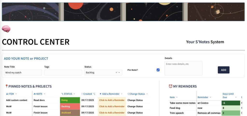
Can you create a data request and approval app? Introduction This week, we’re proving Sigma isn’t just for crunching numbers – it’s an all-weather, cross-functional tool. The challenge is to step outside pure analytics and build a lightweight, system for managing notes and reminders. The goal isn’t to replace your task app. It’s to show …
2025 Week 38 | Sigma: Can You Make Some S’notes? Read More »