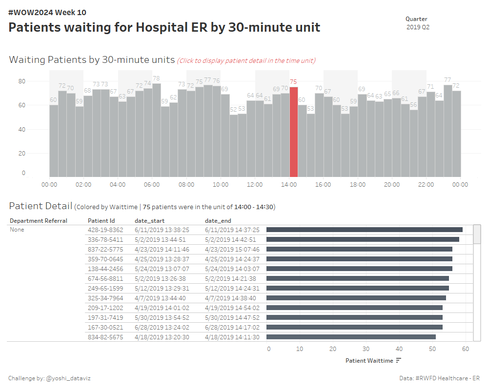
#WOW2024 | Week 10 | Can you visualize when it gets busy?
Introduction Hello there! I’m Yoshi and I joined the WOW Tableau coach team this year.I’ve been participating in the WOW challenges since 2020, so I am really honored to be one of the coaches. Here’s my first challenge for you: let’s practice datetime calculations and data densifications. This week, we deal with dummy data regarding …
#WOW2024 | Week 10 | Can you visualize when it gets busy? Read More