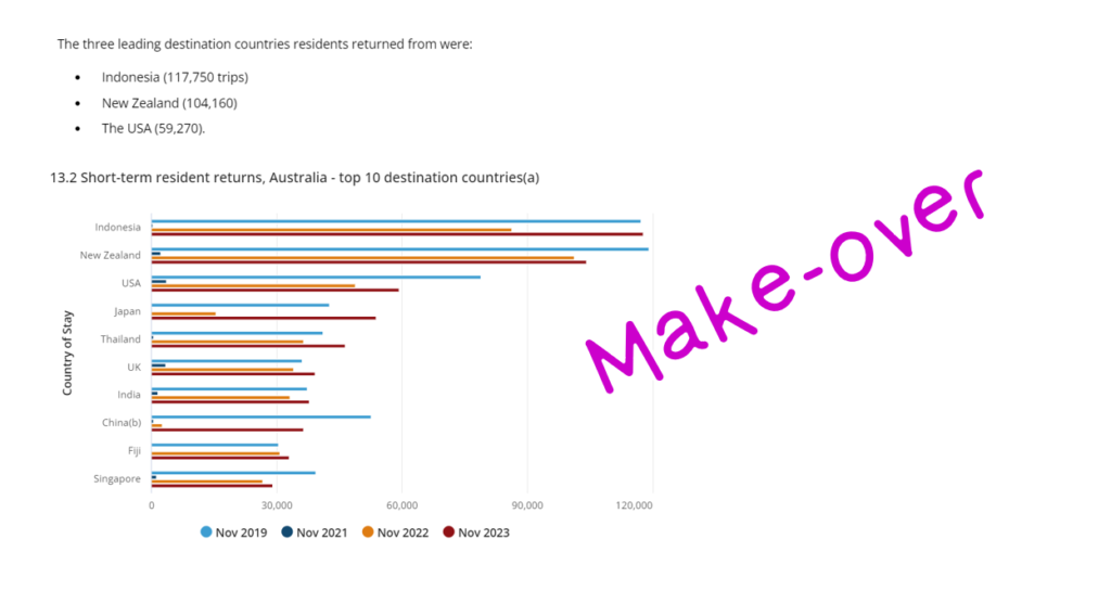
2024 Week 7 | Power BI: Report Re-design – Aussie trips to Indonesia
Introduction This week’s challenge is a little different, we will be looking to make-over a report from the Australian Bureau of Statistics. This report contains a lot of information and data sources to download, so it is up to you as to how much or how little you want to do. The primary challenge, however, …
2024 Week 7 | Power BI: Report Re-design – Aussie trips to Indonesia Read More »