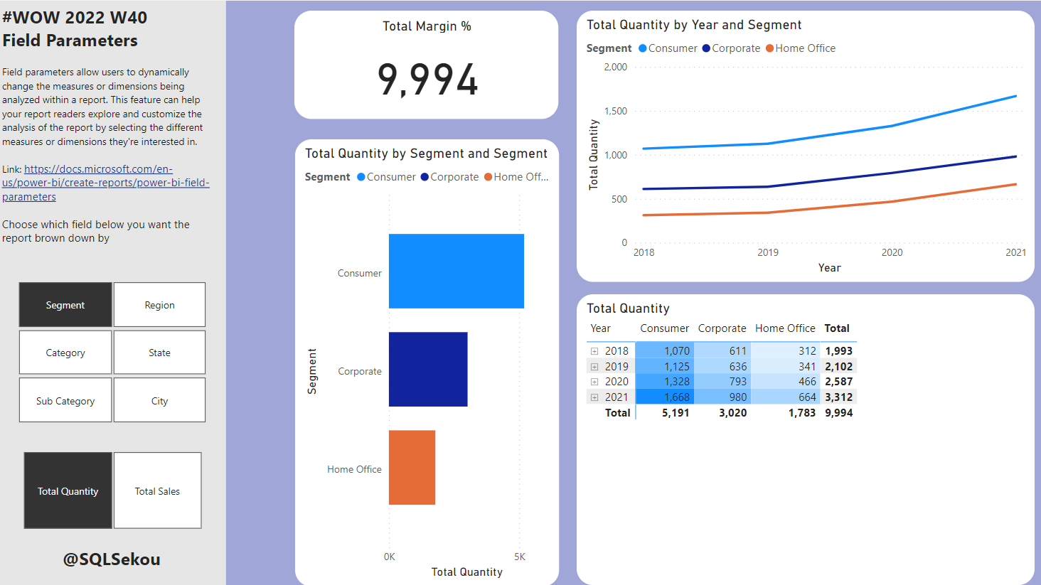
#WOW2022 W40: Power BI: Field Parameters with Conditional Formatting
Introduction This month we are getting the #WorkoutWednesday community involved in the challenges with Community Month. Each week we’re going to have an outstanding member of our community present a challenge. This week we have one of the best out there, Sekou Tyler, gracing us with his presence. Sekou is an accomplished BI professional and …
#WOW2022 W40: Power BI: Field Parameters with Conditional Formatting Read More