2020 Week 53: Can you build with containers?
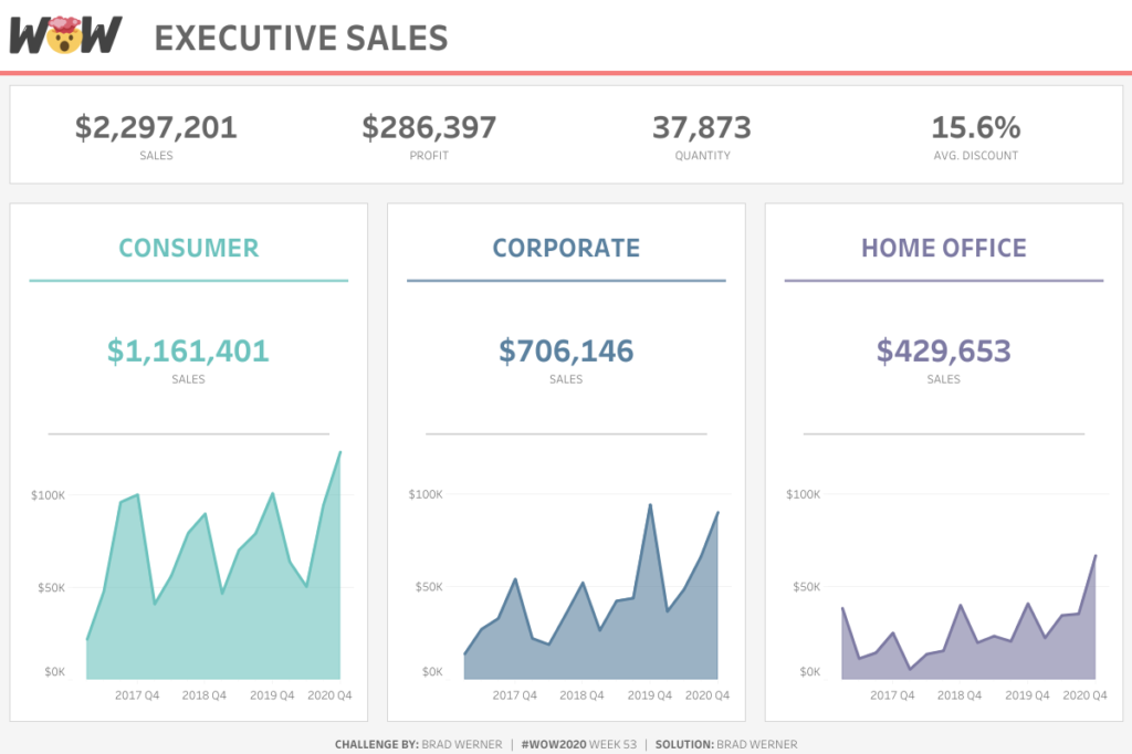
Introduction Brad Werner is responsible for this week’s Workout Wednesday Challenge. Here are all the details in Brad’s own words: I have a confession. When I first started using Tableau, I was a strict advocate for #TeamFloating. Yes, I used to float ALL objects on my Tableau dashboards. I would decide on a dashboard layout […]
2020 Week 53: Can you build with containers? Read More »
community, Tableau, Workout Wednesday