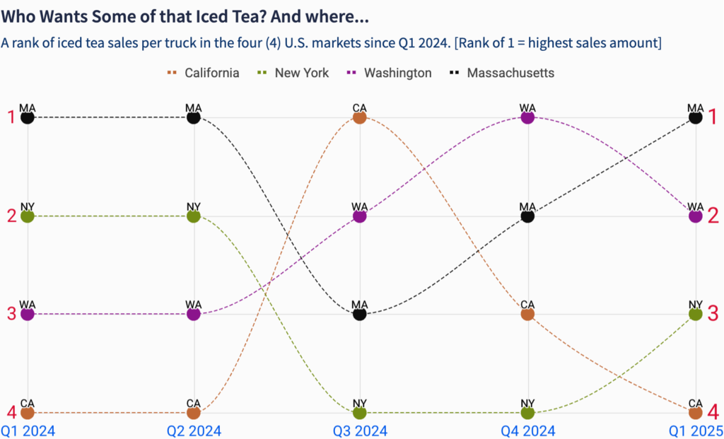
#WOW2025 | 9 | Binary Parameters
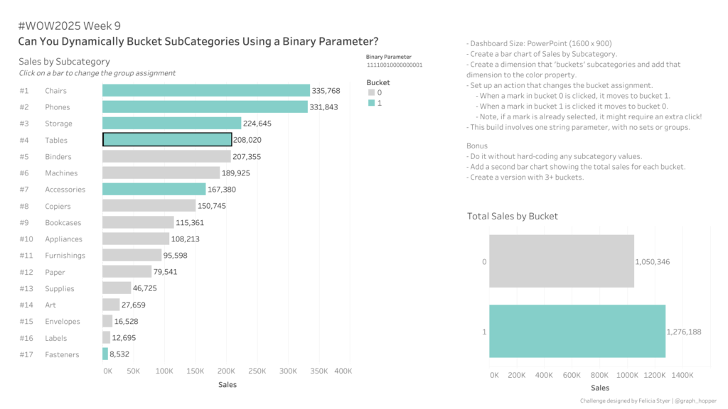
Introduction Welcome to week 9 – and just like that we’re already welcoming March 🚀. I’m so excited to be partnering with fellow Kansas Citian & Tableau Visionary, Felicia Styer, for this week’s challenge. Recently she created a framework for what she calls “binary parameters” which allows for a solution for multi-select parameters. The goal …