#WOW2024 | 42 | Let’s play with Table(au) Extensions!
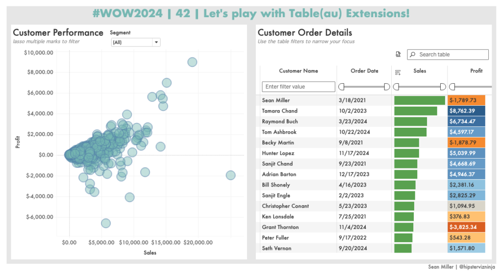
Introduction Hot out of the oven Tableau 2024.3 is here! And with it comes SO MANY amazing new features including the topic for this challenge. Table Extensions! That’s correct, you read that right. Tables are now “native” to Tableau. I used air quotes because it does require viz extensions to be enabled on your cloud/server …
#WOW2024 | 42 | Let’s play with Table(au) Extensions! Read More »