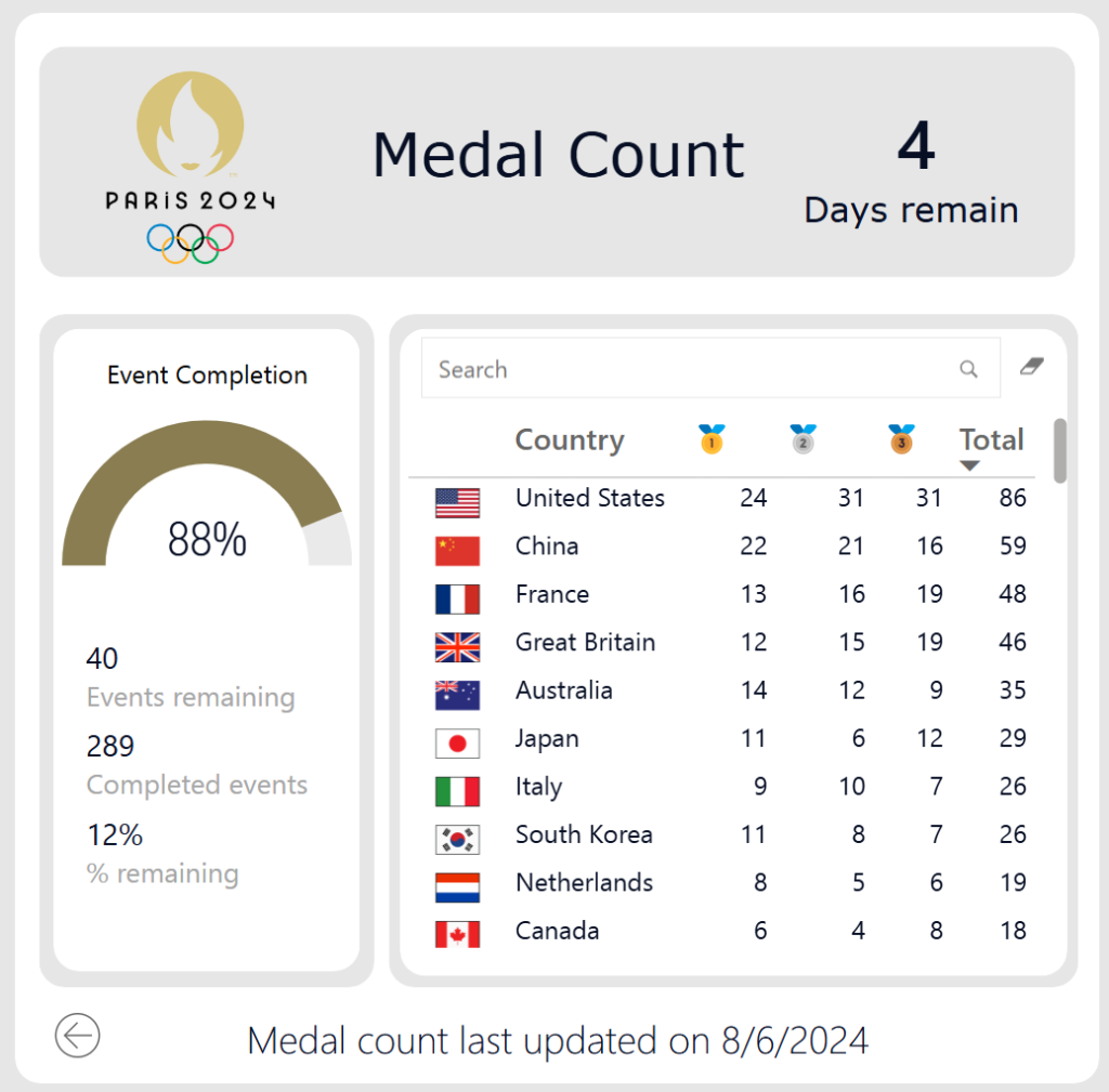
Workout Wednesday

2023 Week 44 | Reusable Components, Designer and Themes

Introduction This week we will be expanding on a previous post by Preena in week 34.  If you did not already complete the wk 34 lesson, you will want to create the Design Style Guide Templated App in your dev org.  This prebuilt app offers valuable insights to best design principles and UX features.  Of …

2023 Week 44 | Reusable Components, Designer and Themes Read More

2023 Week 44 | Power BI: Dynamic Text Boxes

Introduction For this week’s challenge, we will be creating dynamic text boxes to introduce our visuals and tell a story around our data. This is differentiated from the “smart narrative” visual in that we will customize the text and measures that we display to create our own narrative. In the example below, you’ll notice that …

2023 Week 44 | Power BI: Dynamic Text Boxes Read More

2023 Week 44: Can you build an UpSet Plot with just One Calculated Field?

Introduction November is a special month. Workout Wednesday is viewed by thousands of people each week across the globe. And this month we are highlighting those across the world who have great ideas and concepts to share with others. First up is Venkatesh Iyer. Its his second time hosting this year, but if you’ve read any of …

2023 Week 44: Can you build an UpSet Plot with just One Calculated Field? Read More

2023 Week 43 | Power BI: Faceted Stacked Bar Chart Comparison

Introduction This week’s challenge looks at two options for making faceted charts with multiple measures: the Deneb custom visual and the Stacked Bar Chart core visual. The charts compare two different measures across two attributes. You’ll have to get a little creative to accomplish this in both chart types.  Requirements Get the sample dataset from …

2023 Week 43 | Power BI: Faceted Stacked Bar Chart Comparison Read More

2023 Week 42 | Power BI: Add value to tables with SVGs

Introduction Welcome back to Workout Wednesday! This week we’re adding value to tables using SVG images! I was inspired by Sean Miller’s Week 16 Tableau challenge, and thought we could re-create this in Power BI. In this challenge, you’ll use various techniques to enhance the presentation of data within your Power BI table visual. These techniques include utilizing …

2023 Week 42 | Power BI: Add value to tables with SVGs Read More

#WOW2023 Week 42 | Can you proportionally brush from multi-selection?

Introduction This week’s challenge is another inspired by my everyday work. As we launch new features, we look at how different segments of users engage with them. We wanted a smooth way to click into the segment combinations that were of interest, without having to go back to the top to change a bunch of …

#WOW2023 Week 42 | Can you proportionally brush from multi-selection? Read More

#WOW2023 | Week 41 | Can you build a flexible tabular display?

Introduction So my week has rolled around again, and yet again the inspiration for this week comes from this viz by Sam Parsons – Man! That guy is good!!  This week I’m asking you all to recreate a tabular display. It’s a common request from users to just ”show me all the numbers”, while we …

#WOW2023 | Week 41 | Can you build a flexible tabular display? Read More

2023 Week 40 | Interactive Rolodex for Large Data Viewing

Introduction Hello and welcome to the week 40 CRMA challenge! The instructions are written assuming you already have a dev org with Accounts and Contacts loaded.  If you need to spin up a new org with data, see the link below.  This week we are creating a interactive table to search/sort Customers and Accounts by …

2023 Week 40 | Interactive Rolodex for Large Data Viewing Read More

Scroll to Top