Workout Wednesday

Wow 2021 PBI Week 30 Power BI report

2021 Week 30 | Power BI: Remove Punctuation and Count Words With Power Query

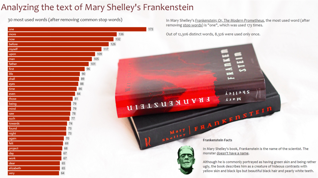
Introduction To celebrate our fourth week of Power Query month, we are going to use Power Query to analyze text data. Inspired by Chris Webb’s blog post, we are going to analyze word usage in Mary Wollstonecraft Shelley’s Frankenstein; Or, The Modern Prometheus. The Power Query techniques used in this week’s challenge are a bit …

2021 Week 30 | Power BI: Remove Punctuation and Count Words With Power Query Read More

2021 Week 29 | Power BI: Let’s Watch the Olympics!

Introduction This week we are collaborating with Preppin’ Data to get a close look at the schedule for the 2020 Olympic Games! We’re also collaborating with the Tableau team and we invite you to take a look at both challenges! With the opening ceremony 2 days away, we thought we’d visualize the schedule in our own time zone. We encourage you …

2021 Week 29 | Power BI: Let’s Watch the Olympics! Read More

2021 Week 29 | Tableau: Can you rebuild the Olympic Schedule?

Introduction This week we have teamed up with the Preppin Data team and the PBI team, to come up with a challenge cross over. As the Olympics is starting imminently we thought it would be appropriate to visualise the Olympic Schedule.  We would encourage you to take a look at all challenges this week to …

2021 Week 29 | Tableau: Can you rebuild the Olympic Schedule? Read More

2021 Week 28 | Power BI: Web Scraping with Power Query

Introduction July is “Power Query Month”, where the theme is focused less on visualization and more on data preparation. Every Power BI challenge requires Power Query to get and transform data, but now we’re going deeper in July! If you haven’t checked out Dave’s challenge from last week, make sure to check it out here.   This …

2021 Week 28 | Power BI: Web Scraping with Power Query Read More

2021 Week 28 | Tableau: Can you build an app to visualize wildfires?

Introduction This week’s Workout Wednesday is brought to you by Josh Jackson.  For those who don’t know, Josh is my husband!  He typically prefers to stay in the background, but asked if he could borrow one of my weeks to share this challenge.  Here’s the challenge in his own words: This week is inspired by …

2021 Week 28 | Tableau: Can you build an app to visualize wildfires? Read More

2021 Week 27 | Power BI: Data Transformation with Power Query

Introduction July is “Power Query Month”, where the theme is focused less on visualization and more on data preparation. Every Power BI challenge requires Power Query to get and transform data, but now we’re going deeper in July! Starting off the month, you’ll use Power Query to perform preliminary cleanup and filtering of data exported …

2021 Week 27 | Power BI: Data Transformation with Power Query Read More

2021 Week 27: Can you find the top and bottom performers?

Introduction Like a fine pinot grigio, I really enjoy a good box-and-whisker plot. There is so much good stat stuff in one place like the min/max, median, top/bottom performers, and outliers in the data set.  I have found, however, that they are rarely used and some business end users find them hard to read.    …

2021 Week 27: Can you find the top and bottom performers? Read More

Power Bi 2021 week 26 showing a histogram with 8 even bins

2021 Week 26 | Power BI: Make a Histogram with Equal Size Bins

Introduction This is our last week using the Nobel Prize data. We are again looking at the age of the laureate when they were awarded the prize. This time we will examine it using a histogram. Histograms measure the distribution of data within defined ranges. So we are calculating age and creating bins of equal …

2021 Week 26 | Power BI: Make a Histogram with Equal Size Bins Read More

2021 Week 26 – Tableau: Profitability with Dual Axis Charts

Introduction This week we are going to do two things:  look at alternative for the most common scatterplot I see in Tableau. use a very uncommon unsynchronized dual axis chart. First, the chart I always run into is this scatterplot of total sales and total profit by order. While we can see which orders were …

2021 Week 26 – Tableau: Profitability with Dual Axis Charts Read More

Scroll to Top