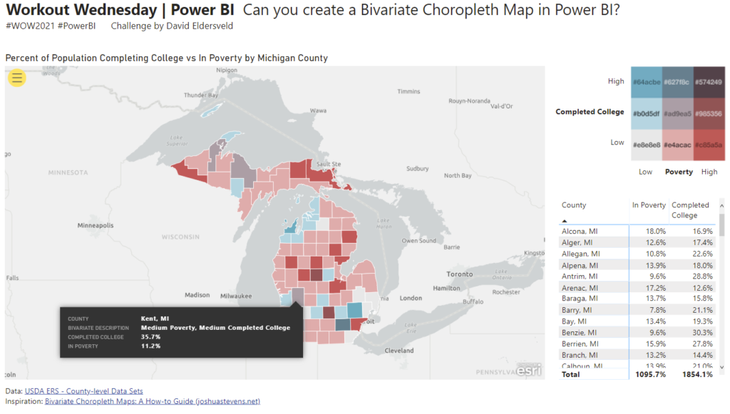
2021 Week 15 | Power BI: Bivariate Choropleth Map
Power BI Conditional Formatting using Background Color, Font Color, and Icons
Power BI Conditional Formatting using Background Color, Font Color, and Icons
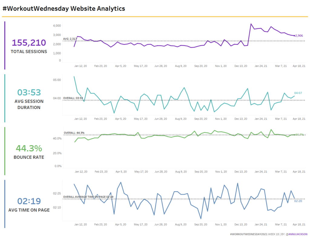
Introduction Lately I’ve been working with Google Analytics data, so I thought I’d pass on a data set to you! Our data set was created by you the audience – it’s extracted directly from our website analytics. This week’s challenge focuses on a lot of little things coming together – dashboard design, formatting, and reference …
Power BI Conditional Formatting using Background Color, Font Color, and Icons
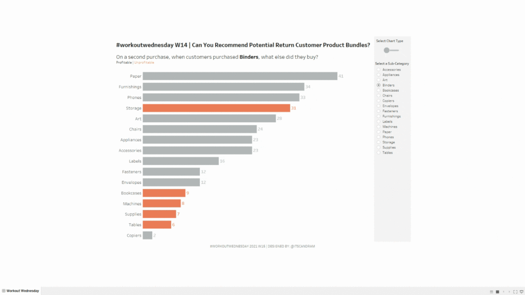
Introduction Have you ever purchased something on Amazon and they show an extra random list of products in the “Customers that purchased X also purchased…” section and you think to yourself, “How in the world did they come up with that combination (e.g., sponges and Skittles)?” They likely have high-powered recommender engines doing all of …
2021 Week 14 | Tableau: Can You Recommend Profitable Return Customer Bundles? Read More
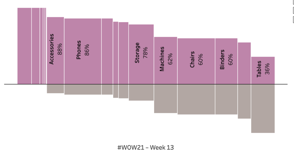
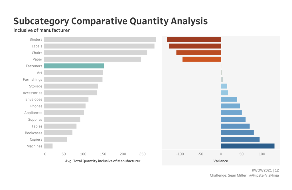
Introduction The goal is a modified mekko chart. My guess is you will need LODs to solve but it is 100% possible with table calculations. Click to open in Tableau Public Requirements Dashboard Size: 800px by 400 px Set the bar height to be percent profitable. The level of analysis should be at the sub-category …
2021 Week 13 | Tableau: What percentage of sub-orders are profitable? Read More
Power BI Conditional Formatting using Background Color, Font Color, and Icons
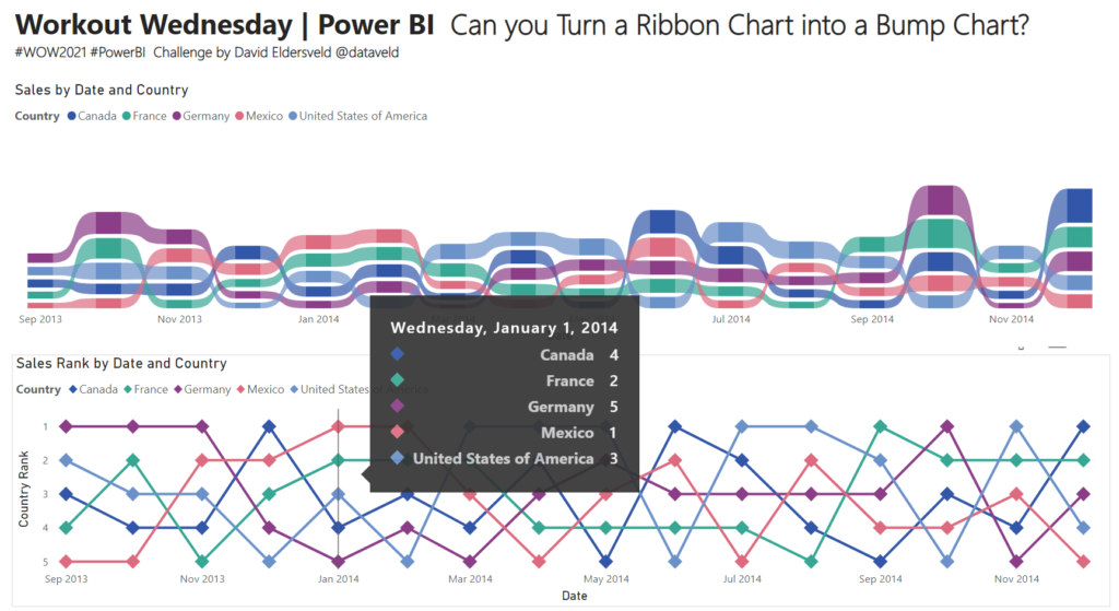
The Fixed LOD gets a lot of the spotlight in tableau but we shouldn’t forget about its cousins INCLUDE & EXCLUDE. Have a go at this challenge to practice use those functions.
Power BI Conditional Formatting using Background Color, Font Color, and Icons
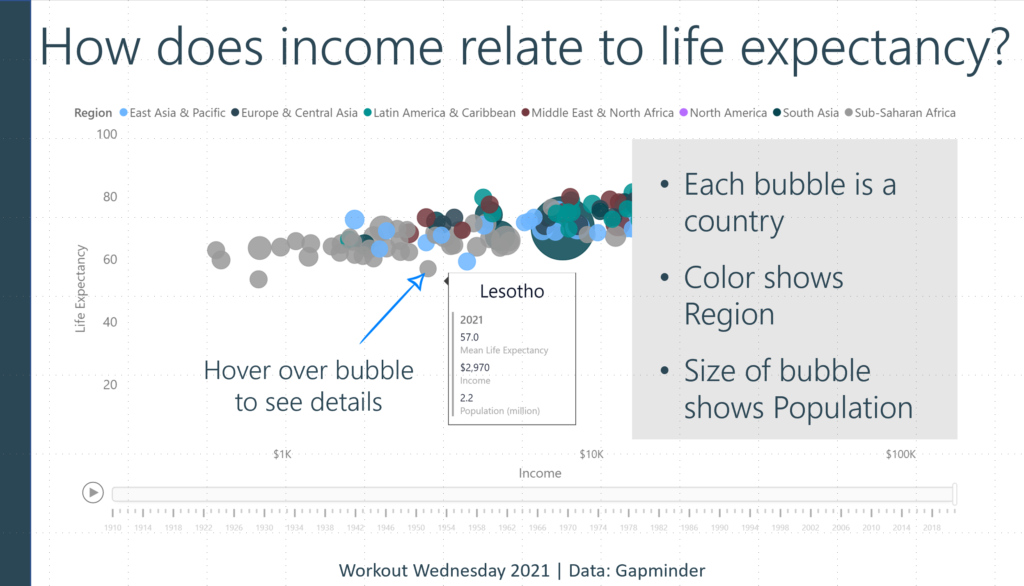
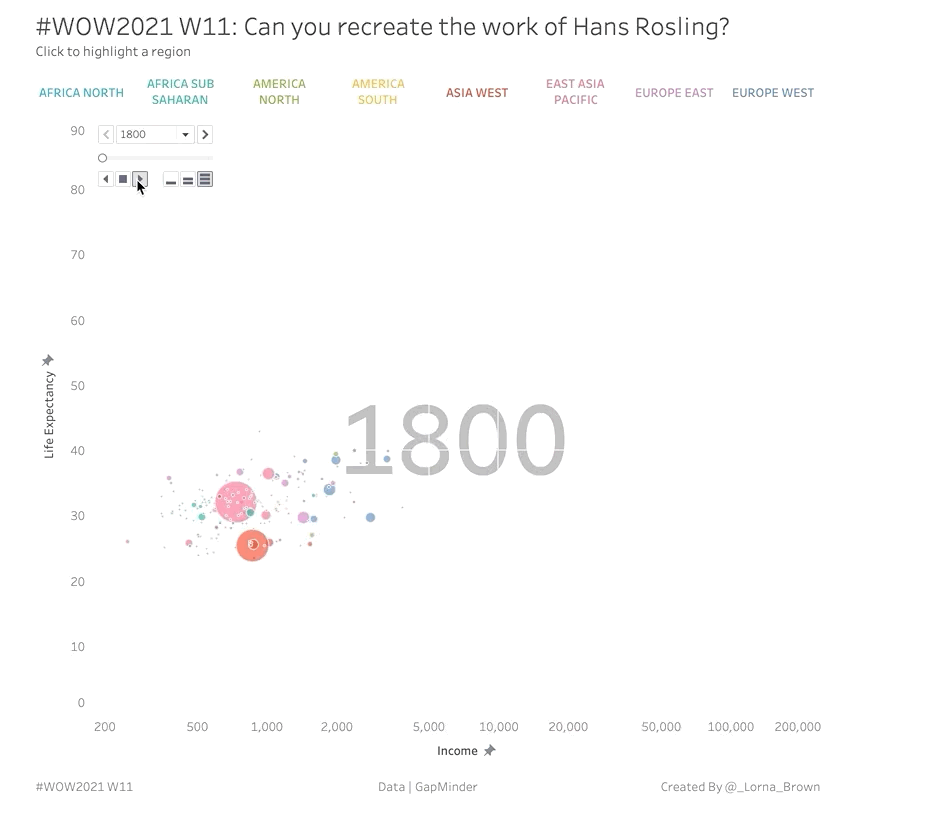
Introduction This week I wanted to throw it back to an old classic chart by Hans Rosling, if you haven’t seen the TED talk I highly recommend watching it. Hans shows how fertility rate and life expectancy has changed over the years. With this example we are going to look at Income per GDP and …
2021 Week 11 | Tableau : Can you recreate the work of Hans Rosling? Read More
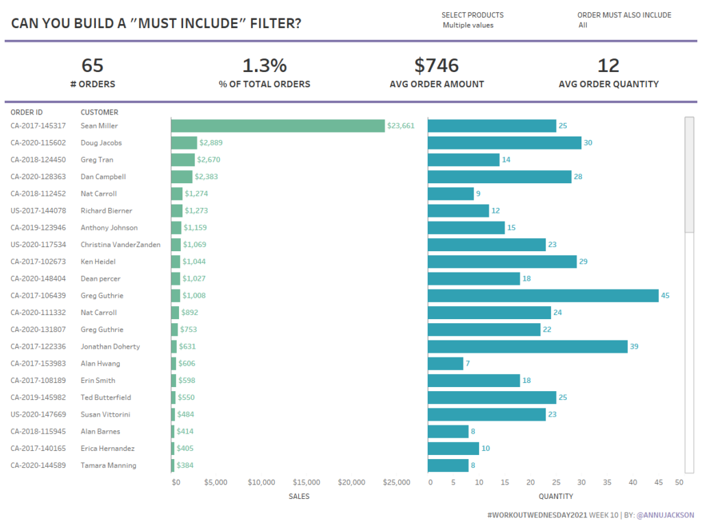
Introduction This week’s challenge is pulled directly from a work challenge I encountered recently. The ask was to build a filtering system that would allow the user to initially filter data and then add a secondary requirement of inclusion. Using the Superstore data set, the functionality we wanted to achieve was: Allow user to filter …
2021 Week 10 | Tableau: Can you build a must include filter? Read More