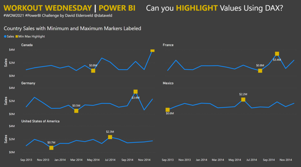
2021 Week 19 | Power BI: Can you Highlight Values Using DAX?
Power BI Highlights with DAX
2021 Week 19 | Power BI: Can you Highlight Values Using DAX? Read More »
Power BI, Workout Wednesday
Introduction Learning complex techniques and beautiful design is super important to mastering visual analytics. But, nothing will stop a user from regularly and joyfully using a dashboard than a poor performing one. It doesn’t matter if it looks like Michaelangelo designed it or it has the cure for some crazy infectious disease – if it
2021 Week 18: Can You Performance Tune This Workbook? Read More »
Tableau, Workout Wednesday
Introduction The Power BI Workout Wednesday team has decided that May is made for DAX! Each challenge this month will require some DAX in the solution. We are going to start our month of DAX with a fun game called Cat or Croissant. You might be familiar with the many versions of “animal or food”
2021 Week 18 | Power BI: DAX Trick – Cat or Croissant Read More »
Power BI, Workout Wednesday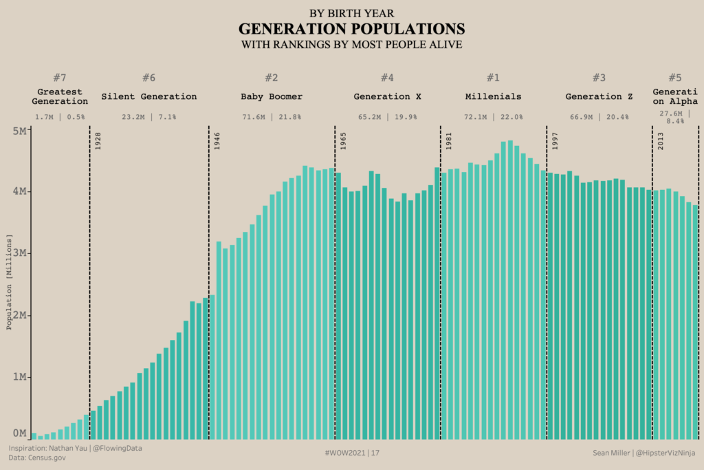
When I came across Nathan Yau’s post, over on his site – Flowing Data, I instantly knew this would make a great #WorkoutWednesday challenge.
Week 17: Generation Population Read More »
community, Tableau, Workout Wednesday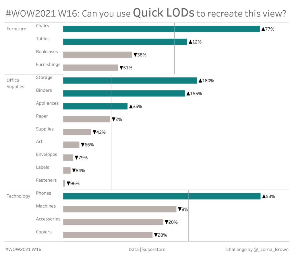
Introduction With Tableau 2021.1 being released last month, I thought it was time for a challenge. This week we focus in on the new feature of Quick LODs. Click to open in Tableau Public Requirements Dashboard Size: 800px by 700 px One Sheet Create a dual axis chart which shows the Sub-Category Average Sales by
2021 Week 16 | Tableau : Can you use Quick LODs to recreate this view? Read More »
Tableau, Workout Wednesday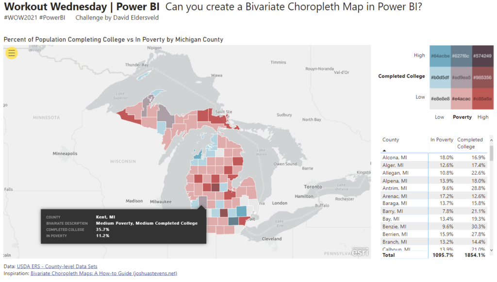
Power BI Conditional Formatting using Background Color, Font Color, and Icons
2021 Week 15 | Power BI: Bivariate Choropleth Map Read More »
Power BI, Workout Wednesday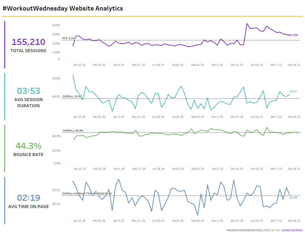
Introduction Lately I’ve been working with Google Analytics data, so I thought I’d pass on a data set to you! Our data set was created by you the audience – it’s extracted directly from our website analytics. This week’s challenge focuses on a lot of little things coming together – dashboard design, formatting, and reference
2021 Week 15 | Tableau: Website Analytics Read More »
Tableau, Workout Wednesday
Power BI Conditional Formatting using Background Color, Font Color, and Icons
2021 Week 14 | Power BI: Accessibility Enhancements Read More »
Power BI, Workout Wednesday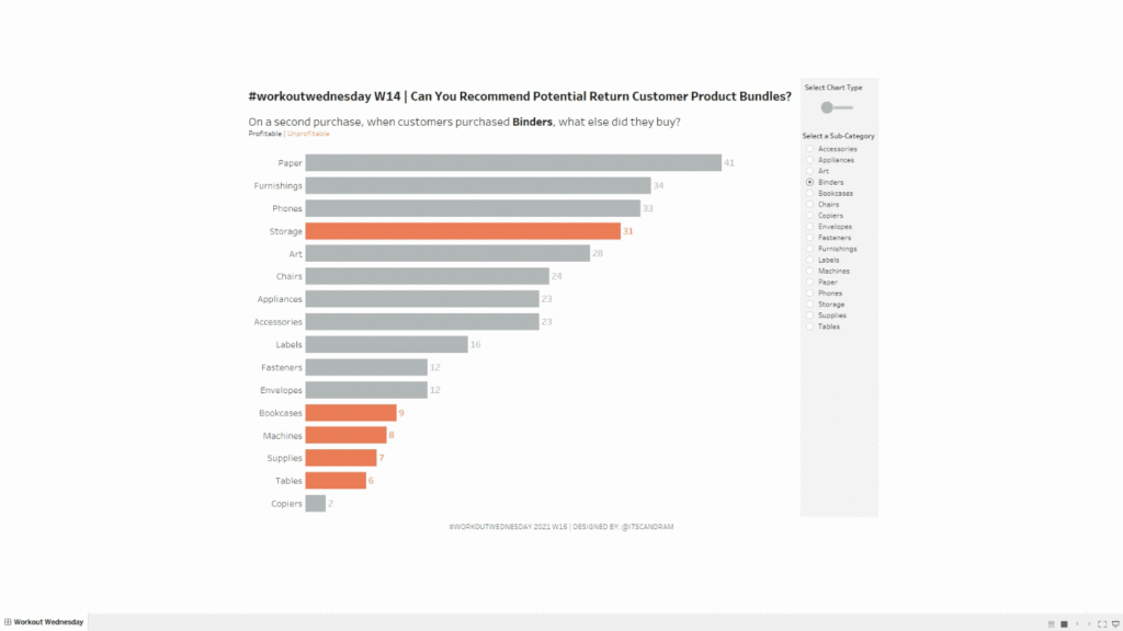
Introduction Have you ever purchased something on Amazon and they show an extra random list of products in the “Customers that purchased X also purchased…” section and you think to yourself, “How in the world did they come up with that combination (e.g., sponges and Skittles)?” They likely have high-powered recommender engines doing all of
2021 Week 14 | Tableau: Can You Recommend Profitable Return Customer Bundles? Read More »
Tableau, Workout Wednesday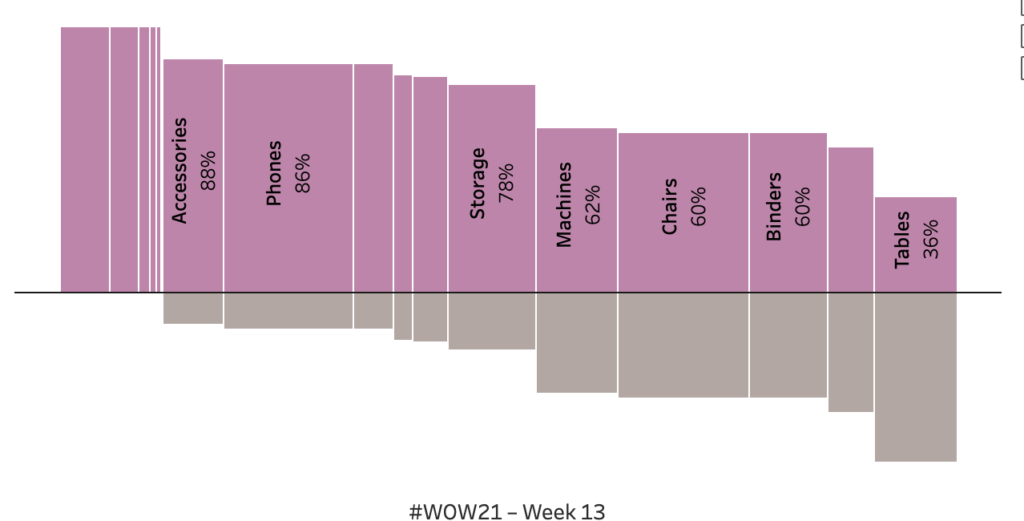
Introduction The goal is a modified mekko chart. My guess is you will need LODs to solve but it is 100% possible with table calculations. Click to open in Tableau Public Requirements Dashboard Size: 800px by 400 px Set the bar height to be percent profitable. The level of analysis should be at the sub-category
2021 Week 13 | Tableau: What percentage of sub-orders are profitable? Read More »
Tableau, Workout Wednesday