Introduction
As promised, this challenge is a continuation of my last challenge in week 3.
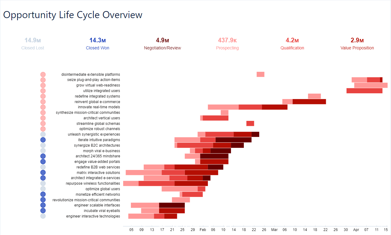
The source data stays the same just this time we convert the chart into a kind of Gantt. While the dot plot highlighted the points in time when the stage of the opportunity changed, this chart focusses a bit more on the time an opportunity spends in a particular stage.
If you worked on the week 3 challenge, you can use the same recipe, and just add the required calculations (I created 4 additional ones). If you haven’t done the week 3 challenge. Just check the dataset section below and work on the challenge from scratch.
Requirements
- Create a recipe the transforms the data to be used in this dashboard
- There is an “opportunity” and an “opportunity history” table
- The history table has one record for each stage change that happened to any of the opportunities
- Re-create the dashboard
- Create coloured KPIs with the amount of all the opportunities that are currently in the according stage
- Create a timeline gantt chart with a row for each opportunity and a coloured strip for the time an opportunity spends in a certain stage
- Make sure you have a date axis underneath the chart
- Add indicator bubbles on the left, indicating the current stage of the opportunity
- Match the formatting in the image below (colours, axis, etc.)