2021 Week 31 | Power BI: Declarative Visualization with Deneb

Introduction

Over the course of Power BI’s Workout Wednesday challenges, you’ve had a chance to try several “custom” visuals. These are typically developed by third parties and may or may not appear on Microsoft’s AppSource marketplace. Generally, you don’t have much control over the visualization apart from whatever format options the developer creates. This week, the focus is on a visual that you can import into Power BI that provides a framework for building your own customized visualization–without having to know how to fully code a custom visual.

If you are familiar with the grammar of graphics and in particular have used or at least heard of the Vega and Vega-Lite frameworks, you have a head start.

Vega and Vega Lite

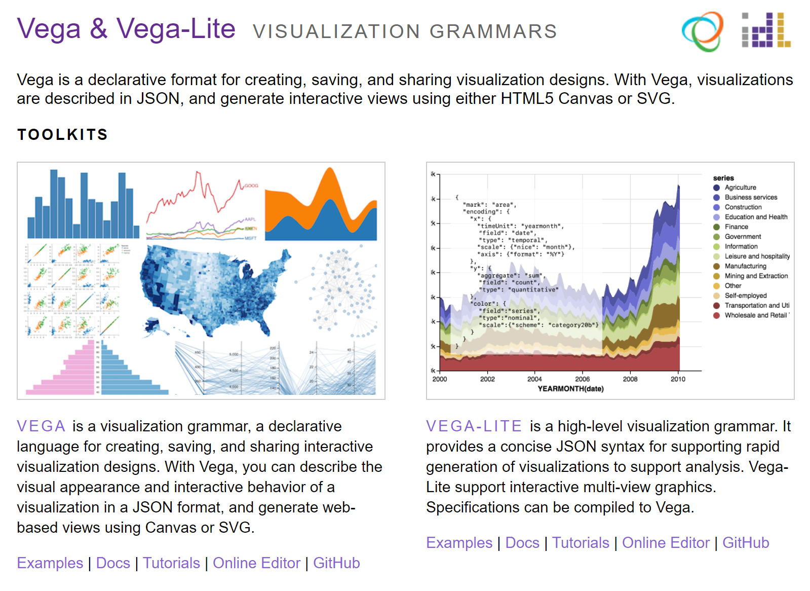
The Deneb visual, developed by Microsoft MVP Daniel Marsh-Patrick, provides a way to use declarative grammar via JSON syntax in Power BI. Deneb gives you a way to adapt either Vega or Vega-Lite into your Power BI reports. Deneb is currently in public preview and will hopefully be available in AppSource in the near future: https://deneb-viz.github.io/

Like the Charticulator challenge in Week 16, the Deneb challenge this week is more about exposure to a potentially valuable new tool than attempting to work through a difficult solution. While Charticular is UI-driven, Deneb is written text. It may not be for everyone, but if you’ve been craving some more customizable options in Power BI, see how it might fit into your toolbelt.

Requirements

  • Load Power BI Desktop’s sample Financials dataset
  • Browse the Vega-Lite docs and examples at https://vega.github.io/vega-lite/docs/
  • Get the Deneb visual (public preview) from https://deneb-viz.github.io/installation
  • Import the visual’s pbiviz file into Power BI Desktop
  • Add Country and Sales to the Deneb visual’s Values
  • Start with a Simple Bar Chart specification in Deneb and add a bar chart plotting Sales by Country
  • Review the JSON specification automatically written for the bar chart
  • Add a color property to the bar mark to change bar colors
  • Add a sort property to the y axis encoding to sort by sales value
  • Create a new visual, add whatever data you want, add an Empty template in Deneb, and try something creative based on Vega-Lite’s or Vega’s examples!

Dataset

Use the sample Financials dataset provided with Power BI Desktop

Share

After you finish your workout, share on Twitter using the hashtags #WOW2021 and #PowerBI, and tag @JSBaucke@MMarie, @shan_gsd and @dataveldAlso make sure to fill out the Submission Tracker so that we can count you as a participant this week in order to track our participation throughout the year. 

Solution

To be published later this week

Leave a Comment

Your email address will not be published. Required fields are marked *

Scroll to Top