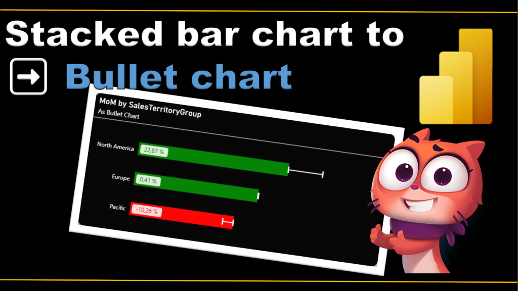
2025 Week 9 | Power BI: From stacked bar chart to bullet chart
Introduction I’m incredibly honored to be part of this amazing group of Power BI enthusiasts, and I couldn’t be more excited to share my very first Workout Wednesday challenge with you all! Have you ever looked at a visualization and thought, there has to be a better way to present this data? This week, we’re …
2025 Week 9 | Power BI: From stacked bar chart to bullet chart Read More »