2024 Week 28 | Power BI: Create custom navigation with Zoe Douglas
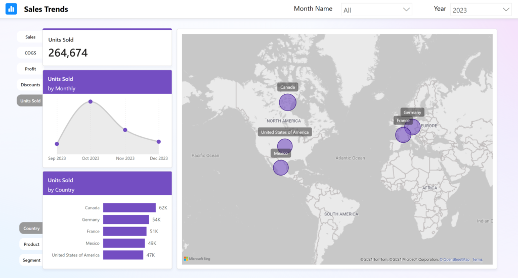
Introduction Welcome back to Workout Wednesday! This week’s challenge is purely dataviz – there is no data transformation involved. A huge thanks to our friend and colleague Zoe Douglas for providing us with a beautiful and fun report to recreate. Find the data and instructions to complete the challenge below, and as always, have fun! Requirements …
2024 Week 28 | Power BI: Create custom navigation with Zoe Douglas Read More »