2021 Week 25 | Power BI: Unicode Characters
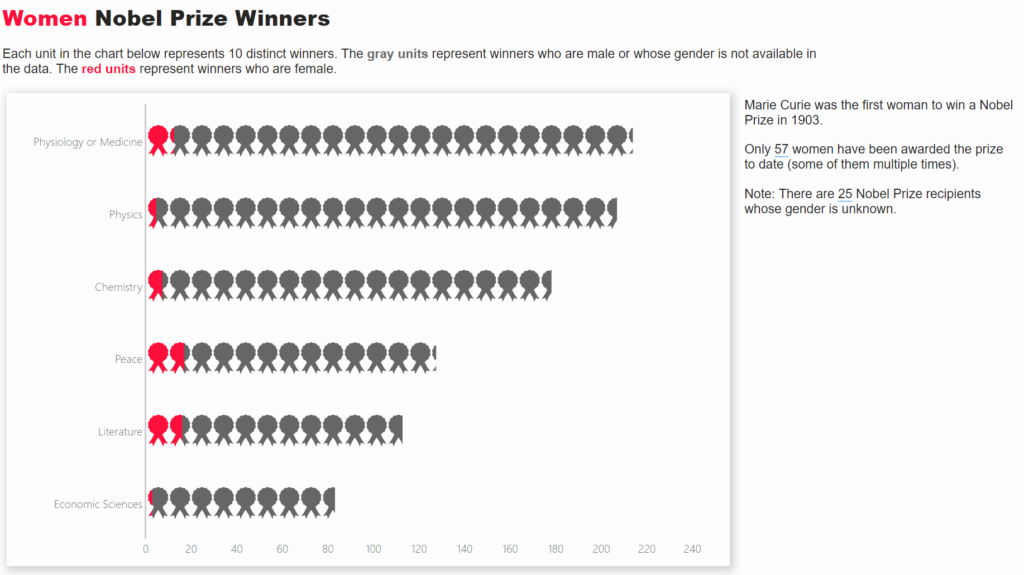
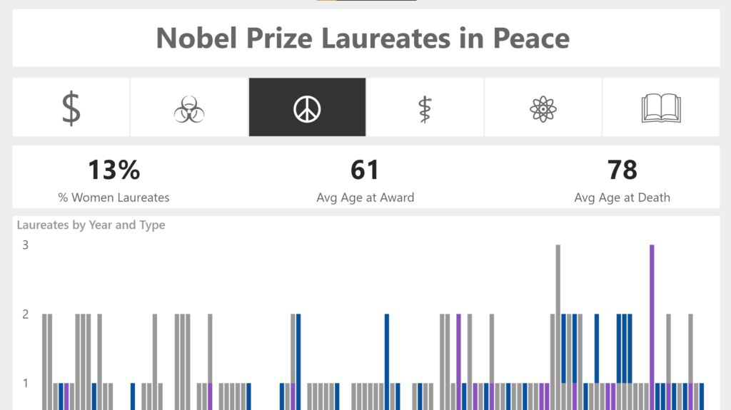
Introduction This week we are building on Meagan and David’s challenges using the Nobel Prize data. We’re also continuing on our customization journey and will have a bit of fun using unicode values. Unicode is a standard numeric value that represents a character, which can easily be transformed into a character in Power BI using a bit …