2025 Week 26 | Sigma: Context
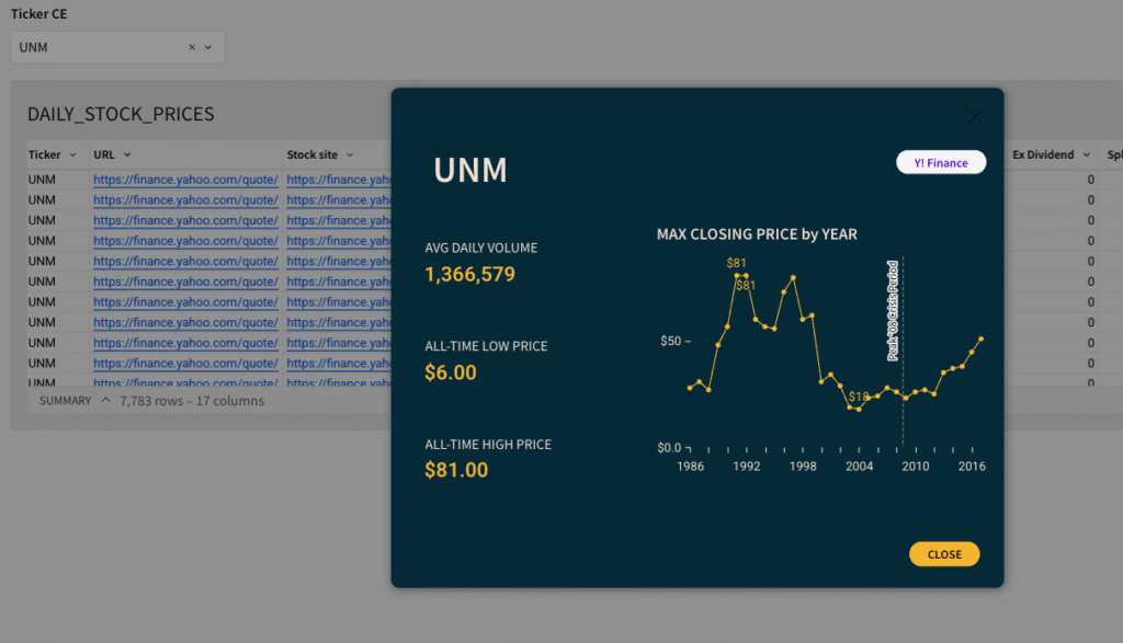
Can you create a custom context menu? Introduction Last time, we explored how modals can unlock dynamic, focused storytelling in your Sigma dashboards. This week, we’re taking it one step further by pairing modals with Custom Context Menus — a powerful new (beta) feature in Sigma. Context menus let you embed right-click actions directly into …