2023 Week 43 | Power BI: Faceted Stacked Bar Chart Comparison
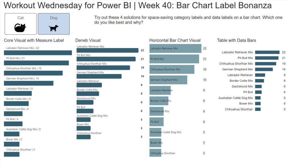
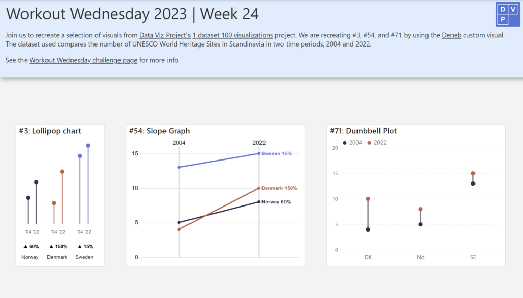
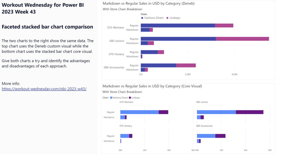
Introduction This week’s challenge looks at two options for making faceted charts with multiple measures: the Deneb custom visual and the Stacked Bar Chart core visual. The charts compare two different measures across two attributes. You’ll have to get a little creative to accomplish this in both chart types. Requirements Get the sample dataset from …
2023 Week 43 | Power BI: Faceted Stacked Bar Chart Comparison Read More