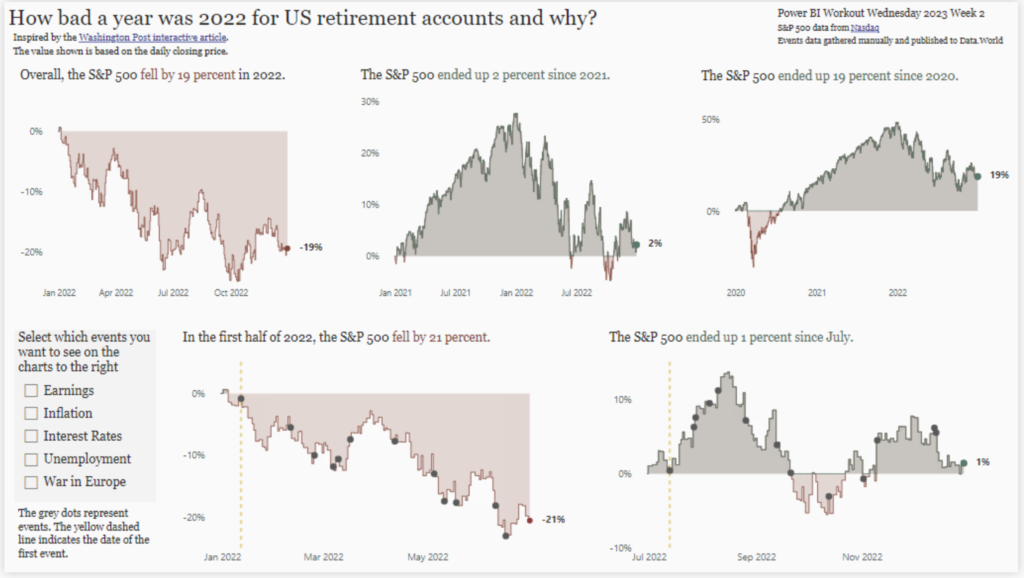
2023 Week 06 | Power BI: Create a Calendar Heatmap
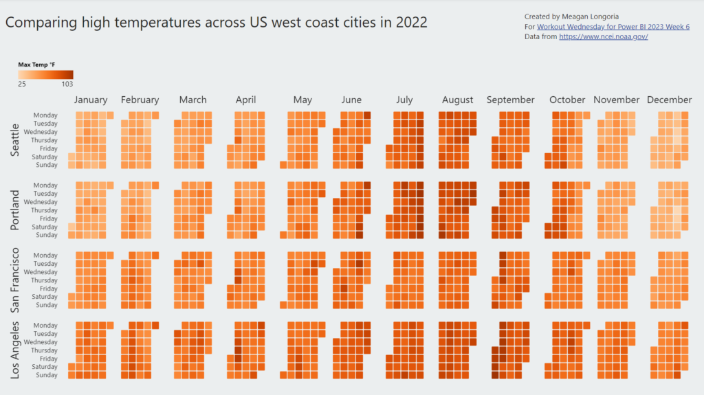
Introduction For this week’s challenge, we are creating a calendar heatmap. There is no default visual for this, and many of the custom visuals are not very flexible, but Deneb has us covered. Requirements Create a calendar visual: Show day of the week on rows and week on columns. (Hint: If you get stuck on …
2023 Week 06 | Power BI: Create a Calendar Heatmap Read More